
I get emails all the time from people who want to start their creative businesses but they feel beyond overwhelmed by the idea of creating professional, high-quality branding on a shoestring budget.

And believe me, I get that.
If you're starting a business, you want to feel proud of what you're putting out into the world. But when you're not trained in Photoshop or you have no experience in design, it can feel like this huge, daunting roadblock to your forward progress.
Not anymore, my friends.
It's my mission to make branding less intimidating and more accessible to people of all design backgrounds and skill levels.
That’s why I set out to uncover some FREE tools that would allow someone to create a logo that looks and feels professional - one you would be proud to put on version 1.0 of your website or business card.
So… today I’m going to show you my step-by-step process for creating a website-ready logo using Google Drawings, not Photoshop.
But first, let's go over some basic rules about logo design.
Basic Rules For Creating A DIY Logo
As a designer, I can tell you there's a LOT more that goes into effective logo design than people think. There's concept development, thumbnail sketches, color theory, typography , balance and spacing and variations... the list of things to consider goes on and on.

BUT, right now, I want you to forget all of it.
That's right, forget it. Overcomplicating things will only lead to self-doubt and more waiting, and the world NEEDS your gifts so we're not going to focus on all that. There's a time and place for all that design thinking, sure, and maybe when you've got your business off the ground and you're swimming in gold like Scrooge McDuck you'll invest in a quality logo.
BUT for right now, your #1 goal should be to launch your idea to the world in the best, FIRST version you can. And that's what these basic rules should cover.
1. Avoid using more than two typefaces.
This is a pretty standard rule-of-thumb for logo design. You don't want your logo to be distracting or feel disjointed, so by keeping yourself limited to two, well-balanced typefaces, you can ensure your logo remains effective and versatile. For some further reading on typography and pairing typefaces, I love this post on Go Live HQ.
2. Err on the side of simple and legible, not clever and stylistic.
I get it. It can be tempting to create some super-meta, highly conceptual logomark. Maybe you're a knitter who uses eco-friendly threads so you want a leaf with a needle through it and a circle to symbolize the cyclical nature of our relationship to earth. All of that is wonderful. BUT if it's not executed properly, it could leave your audience feeling a bit bewildered. The purpose of a logo is to be identifiable and to support the memory of your brand identity in the minds of people. The safest bet in that case is to make sure your design is legible, easy to understand, and not overly complicated.
3. Be honest with yourself.
The key here is this: don't try to be someone you're not when it comes to your design skills. Does pairing colors or picking out fonts make you break out in hives a little bit? OR, do you have the opposite problem? Do you get lost down the rabbit hole of DIY design because you don't know when to simply DECIDE and move on? Either way, it's okay! Whatever you think your weaknesses are, understand those going into the design process and plan accordingly.
If design scares you, give yourself permission to keep it simple. And if you typically get lost in the proverbial design forest? Give yourself a time limit and then make the commitment to decide and move forward. Remember, nothing is permanent and your job is just to create something you're comfortable with and can be proud to promote when launching your business!
Now let's dig in to how you can use Google's free tools to create your logo.
Steps To Creating Your DIY Logo
Step 1: Create your document using Google Drawings.
You may not have even known that this tool existed, but it's been hiding in your Google Drive! All you need to access it is a Gmail account or Google Drive account.
Start by visiting drive.google.com, click NEW and navigate to the Google Drawings selection (under "More.")

Step 2: Name your document & adjust size (if necessary).
The first thing I always do when I create a new document is rename it. The last thing you want is a bunch of "Untitled drawings" floating around your Google Drive.

I also take a second to choose File > Page Setup... to make sure my document is big enough.

If you select the dropdown in the Page Setup popup, you can navigate to "Custom" which will allow you to set your document size in inches or pixels, whichever you prefer. I recommend pixels since you'll probably be creating this logo for your website. The default tends to be set at 960x720 pixels, which is plenty big for what we need.
The bigger the canvas size, the less chance of losing resolution (crispness) if you go to drop it into your website later on, so I recommend starting with something close to 1000 pixels (1000px).

Step 3: Start your design by adding a text box with your business name and picking out your typefaces.
I'm not going to get too much into how to choose typefaces for your logo, though I do go into it at length in the Better Branding Course, but you want to select a typeface that matches the personality of your brand.
As an example, let's pretend I'm launching my wedding photography business under my name "Caroline Kelso." I want my brand to feel elegant and slightly feminine, but with a modern edge.
First, use the Text Box tool to drag your text box across the canvas (you want it to stretch as far across your canvas as possible.) Then, type your brand name in the text box.

After highlighting your text, navigate through the Google Font options in the formatting toolbar to find something that fits the tone your going for.

In my case, "Unna" is a serif font (meaning it has the bars across the letter forms) which makes it feel a bit traditional and classic, but the square shape of the letters and the sleek, straight feel of the serifs give it a more modern edge.
Be sure to change the size of the font to stretch the text across the width of your text box, and center it using the button in the toolbar (this will help with alignment later on!)

Now this is a great opportunity to add an additional identifier to your logo. In the case of my example, if I'm launching a photography business and that's not abundantly clear from my name, I'll want some way for people to immediately understand what I do.
This is when you'll want to add an additional text box in a complementary font. I chose a thinner san-serif font (without bars) to balance out my main font. Also, remember to create hierarchy in your design. You want to help people understand which is the more important part to read first (your brand name) followed by the more secondary information (your identifier.) To establish hierarchy, I made my identifier smaller in size and a thinner font.
First I highlighted my text, and changed the font the "Muli" using the font drop-down.


Now, I admit that your text formatting options are more limited than a design program here, but that's when you get creative! Try typing your text in all caps (see above) or try using an italic font to create visual interest.
Quick Trick: If you want to adjust the tracking in your type (the space between letters) to make it feel a bit more sophisticated, unfortunately the text formatting tools won’t let you. However, you CAN manually type one space between each of your subheading letters to give the illusion that the tracking has been altered. Sneaky, I know! That's what I've done in my "wedding photography" subhead here:

Then be sure to center and adjust the size so that it feels in balance with your primary brand name.

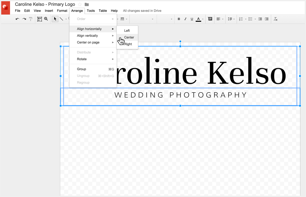
Step 4: Adjust spacing and alignment of your logo
If you have more than one text element at this point, be sure to select both text boxes and use the alignment tools to make sure they're centered with one another and that the spacing between them is just the way you want it.
Step 5: Add your brand colors.
Highlight your text and use the text color tool to change the color if you want. Use one of the colors in the drop down, OR select "Custom" to use your own unique hex code.
In my case, let's say I used a tool like Coolors.co to find the hex code of a color I want to be my primary brand color. I simply paste it in the color picker to modify the color of my text.

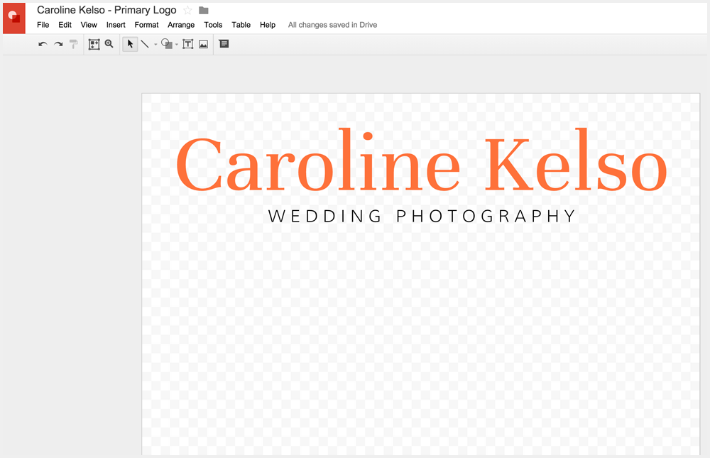
For my example, I decided to go with an orangey-coral color, inspired the color of the gorgeous floral bouquet I'll be photographing in my fictional business world. :)
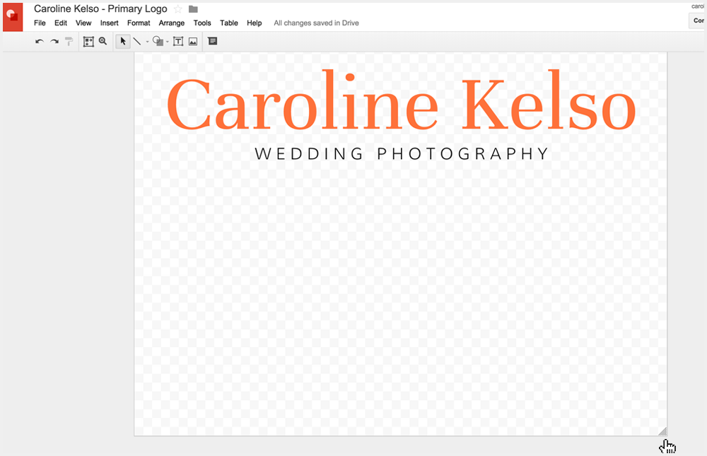
Step 7: Crop canvas and save as a transparent png file.
Now that you have your brand new logo, you'll want to crop down your canvas size so that if you upload the file onto your website, there won't be extraneous space around the edges.
The simple way to do this is to grab the bottom right-hand corner of your document and drag up until you have about the same space all the way around your design.


Once your logo is the proper size and crop, select File > Download As... > PNG image. This will export a .png file with the transparent background in tact, allowing you to easily upload it to Wordpress, Squarespace or whatever website platform you're using.

Tip: If for some reason your canvas background is not the checkerboard transparent background you see above, right click anywhere outside your document (in the gray area) and select Background > Transparent.

You also have the option to export your logo as a vector file by using File > Download As... > Scalable Vector Graphics (.svg). This will create a file that could be scaled up or down without fear of losing resolution. You could use this to print your new logo on a large banner for an event OR you could give it to a designer to edit in a vector program like Adobe Illustrator. Pretty cool!

Step 8: Use on your website!
Finally, you get to see this new puppy in action! I made a fake Squarespace site with my new photography logo, but all I had to do was upload my .png file that I downloaded in Step 7. Good to go! A few style tweaks of one of their templates and I'm ready to launch a professional, quality brand!

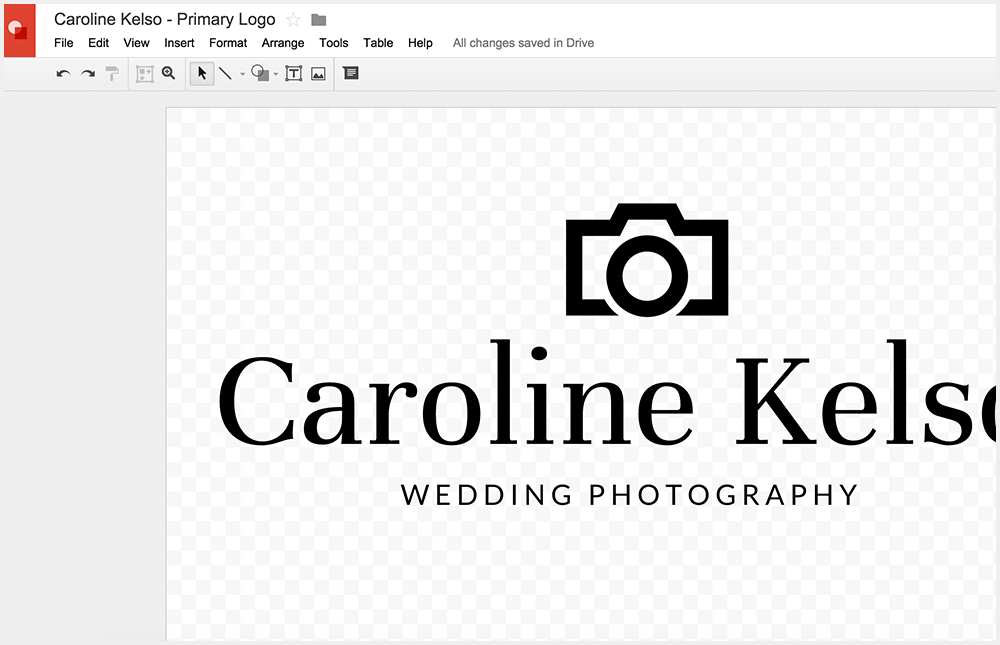
Optional Step: Add brand icon/graphic elements to your logo.
Now, if you're a beginner, just stop reading here! No need to complicate your beautiful type-only logo with unnecessary elements. However... if you're itching to pump up the volume and curious what other design features are available to you in Google Drawings, here are some options I've played around with.
Add geometric shapes as graphic elements for more pizzazz.
Tiny colorful circles become... confetti!

A dotted line plus some random shapes using the "Polyline" selector under the Lines drop-down adds fun and visual interest. Drop the transparency on the color fill bucket of the shapes for added fun.

White text on a color-filled rectangle can be understated and sophisticated yet professional.

Ready for even more of a challenge? Use an icon resource like The Noun Project to find an icon (this one with a Public Domain license so it's free to use) and use it as a template to draw your own illustration using the Polyline tool. In this case, the lines were too thick for my taste so I drew my own and put it on top of a Pentagon shape using the "Shapes" dropdown.


Or... one of my personal favorites, use the "Scribble" tool to create the illusion you've colored in your illustration.
Start with an icon from The Noun Project like I mentioned before (this one created by Alex Berkowitz.) Choose "Scribble" from the Line dropdown and drag your cursor over the illustration.


Then, change your line width to something thicker like 8px.

Change the color of your line to the color you want your scribble to be.

Finally, use the Arrange > Order > Send to Back option to put the scribble beneath the illustration outline. Now you have a "color outside the lines" brand icon!


These are just a handful of ways you can use and build on Google's Drawing tools.
Don't let your fear of Photoshop hold you back from creating a professional logo that you're proud of!


