Hand-Lettering For Beginners: A Complete Guide To Creating A Hand-lettered Web Graphic From Start to Finish
Pssst...did you know I now have a super fun and affordable e-course to get you started with hand-lettering? If you're interested in learning more, you can check it out by clicking here.
More and more these days I’m using hand-lettering as a design tool throughout my brand presence, not just in the art I produce, but also in things like web graphics and social media images (like these:)
I love that it adds a personal touch of humanity to otherwise standard digital designs, and I also love that it allows me to include "typography" that I know no one else in the world will have.
If that's something you're interested in doing for your own brand, I thought it might be helpful to show you my step-by-step process from start to finish for creating these kinds of hand-lettered graphics.
The process can be broken down into three phases, and hopefully this in-depth post will help you get started mastering all three!
ps. Scroll all the way down to download a free traceable alphabet that was previously only available inside the Better Lettering Course! Consider this post your peek behind the curtain of that online class!
Now... on to Phase 1!
Decide on a basic composition by sketching out some thumbnails.
Whatever your phrase is that you want to hand-letter on your web graphic, you want to begin by planning out the basic composition of how the words in that phrase will fit together.
When I say "composition" here, I'm simply referring to how the various parts of your hand-lettered sketch fit together and are positioned in relation to one another.
(Over time and with practice, you may be able to streamline this process and come up with these in your head, but I still try to put my ideas down on paper to make sure I don't have to re-do my piece down the road.)
Some things to keep in mind about composition:
- Emphasis. Think about what word or words in your phrase you want to emphasize. You may want to make those words stand out by making them bigger, bolder, or in a different style.
- Balance. Is there a way to create symmetry or balance in your design? Look for words or phrases that can be paired up or reflected in a similar way.
- Connection. Do you want any of your letters to connect with one another? OR do you want them to mold around each other like puzzle pieces? Look for opportunities to create connection between letters/words if so. (ps. There's a bonus video below on how to cultivate this skill!)
For example:
Let's say I want to letter the phrase "Just Keep Creating." Below is how I might draw out three different "thumbnails" (aka tiny sketches) with different compositions.
Ultimately I realized that I wanted the most important word to be "creating" so by making Just Keep slightly smaller and making the "C" and "G" of Creating a bit taller, I've made a little cradle of sorts for the two less important words in my composition to hang out.
I may not have been able to see that at first had I not sketched out a few possibilities first.
Draw out your piece in pencil first and then fill in your letter forms in ink.
Once you have a basic idea of what you want your composition to be for your hand-lettered piece, the next big step is, of course, to DRAW IT!
Now, if you’re new to hand-lettering, I’ve broken this down even further into mini-steps, showing you how I build my individual letters in phases.
1. Draw the "bones" of your letter form in pencil.
2. Once you have your basic letter form, you can go back over it in ink (here I'm using a Sharpie!)
3. Add some "muscle"😉 by thickening your strokes to your liking.
I'm using a PaperMate Flair pen for more accuracy here!
4. Fill in your letters.
If you want that "shine" look, leave empty white areas in your strokes.
Or... if you want a bolder look, fill your letters in completely like this!
5. Now erase your pencil marks (once your ink is dry) and voila!
And now here's how my "Just Keep Creating" piece came together in these stages!
Step 1: Letter forms in pencil!
Step 2: Going back over in ink. (You'll notice I just use my pencil marks as a guide so I can focus more on letting my hand flow and less on "tracing" my pencil perfectly!)
Step 3: Thickening strokes.
Step 4: Filling in my letters.
Step 5: Erasing any stray pencil marks.
Make it digital! Add your lettering to your web graphic.
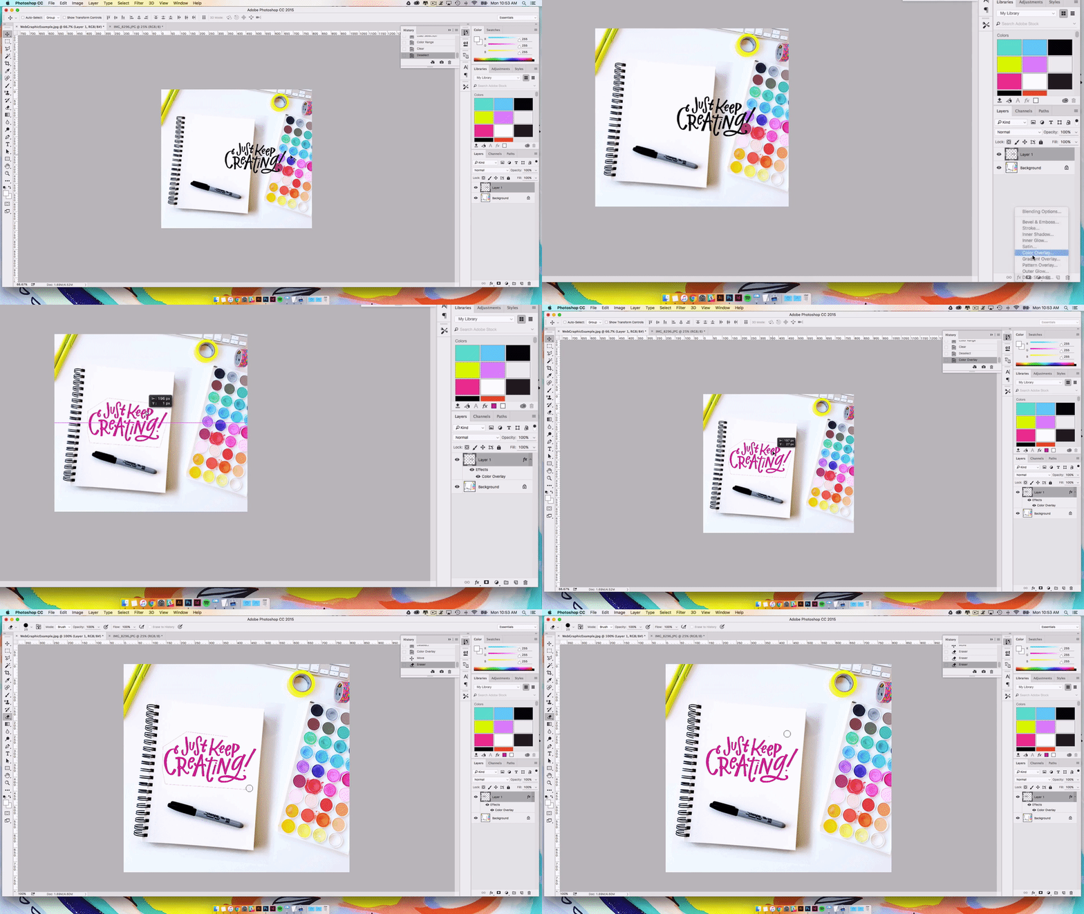
Now that you have your hand-lettered piece, it’s time to add it to your web graphic using Photoshop. (Scroll down to see these steps presented in video format!)
Step 1: Take a photo of your piece with your smartphone.
Be sure that you’re taking your photo straight on and not at an angle or it will warp your letters. You also want to make sure it’s good lighting.
You can also use the settings on your camera to turn on gridlines if it helps you keep things squared up.
This is why it’s also important to do your hand-lettered piece in black ink on white paper because you want maximum contrast between your lettering and the page.
(Note: you can also scan your photo, but I find that taking a photo is faster and usually works just as well.)
Step 2: Send your photo to your computer.
Usually I use Airdrop to send my photo from my phone to my laptop over wi-fi, but you can just as easily email it to yourself as well. Just make sure if you do that you select “Actual Size.” You want your photo to be at the highest resolution possible when you pull it into Photoshop!
Step 3: Open both your web graphic AND your lettering photo in Photoshop.
Whatever photo you want to add hand-lettering to, whether it’s a blog post image, a sidebar banner or just a photo, make sure you have that open in Photoshop first. Then, select your photo that you just sent to yourself, and open that in Photoshop as well.
Step 4: Adjust the Levels in Photoshop to maximize contrast.
Hit Command + L (on a Mac) to pull up your Levels menu in Photoshop.
You’re going to use the Levels sliders to make the whites/highlights of your paper as light as possible (right slider) and the darks/shadows of your lettering as dark as possible (left slider).
Be sure you don’t slide the left hand side too far or you’ll start to lose the crispness on the edges of your lettering. (However, if you want a more rough and textured look, you might like that!)
For good measure, I also hit SHIFT+ Command + U which brings the saturation all the way down, making the photo black and white. This aids in the contrast by removing any colored “halos” that might show up around your letters.
Step 5: Cut your lettering and paste into your web graphic.
Once your lettering looks nice and crisp, use the selection tool to select the area around your lettering and use CMD + X to cut it from your document.
Then, pop over to your web graphic document and hit CMD + V. This should paste your lettering in as a new layer. Then you'll just want to resize it so it fits on your canvas. (Be sure to hold down your shift key as you transform so you retain your proportions!)
Step 6: The magic!
Now that your lettering is in your web graphic, there’s just one problem -- there’s a big white background around it!
To fix this with one click, head over to your Layers palette and make sure your lettering layer is selected. Change the layer style to “Multiply” which will turn everything that’s white transparent!
Then you’re free to adjust your lettering as you wish.
...And ta-da!
A fun, hand-lettered graphic for your branding/social media needs!
Step 7 (Optional): Change the color of your lettering.
If you don’t want your lettering to be black, here’s how I change the color of my lettering.
First, undo the last step by setting your Layer Style back to “Normal.”
Then, Command + click your lettering layer which should make a selection pop up of only that layer (look for the dancing ants around your layer!)
Head up to Select > Select Range... and use your eye dropper to pick up the white color of the paper background around your lettering. Be sure you click the eye dropped in the white INSIDE your dancing ants. This will tell it to select everything that is that color within your lettering layer.
Then hit... DELETE. This will leave only your lettering remaining.
Then, head over to your Layers palette and add the Color Overlay layer style where you can select whatever color you like. Be sure to use your erase tool to erase any remnant edges around the outside of your old paper halo.
If you want SUPER crisp edges around your lettering and you don't like the rough texture from your pen/paper, you can also vectorize your lettering in Illustrator at this stage (something I go over in video form inside the Better Lettering Course! Click here to join for just $20!)
Ta-da! (Again!)
**BONUS FREEBIE AHOY!!**
If you're curious about how I draw my letterforms and get my signature "shiny" style, pop in your email to get this free traceable alphabet worksheet!
And of course, if you're interested in learning more about the basics of hand-lettering in depth, I created a comprehensive but affordable online course sharing everything I've learned about hand-lettering in six lesson modules and nine video lessons. If this is a skill that you'd like to learn, join over 3,000 students inside the course!
My Favorite Acrylic Paint & Pen Brands: #MVArtShop Ask Me Anything Video Series
Inquiring minds want to know!
I asked you guys what questions you were most curious about when it comes to my artistic process, my Abstract Affirmations Daily project, and opening up the MV Art Shop.
I got some great questions on Instagram so I decided to create a few Q&A videos to answer my favorites!
One question I get asked a lot is...
What type of acrylic paints or pen brands are your favorite?
In the video below, I'm in my studio showing you first hand what brands I love to use, plus my super secret weapon: the best white paint pen of all time.
Click play to give it a watch!
Product Links:
+ Liquitex Heavy Body Acrylic Paint (Turquoise Deep)
+ Golden Fluid Acrylic Paint (Cerulean Blue Deep)
+ Folk Art Multi-Surface Craft Pain (Bright Pink)
+ Sharpie Permanent Markers, Fine Point, Black, 12-Pack
+ Paper Mate Flair Felt Tip Pen, Medium Tip, Black, 12-Pack,
+ Uni Posca Paint Marker PC-3M, Black, 3-Pack (Japan Import)
Want to check out all the #MVArtShop Ask Me Anything videos?
Click here to view the whole playlist over on YouTube! If you have any other questions you want me to answer in another video, feel free to drop it in the comments!
How To Choose Which Platform To Use To Sell Your Art Prints (#SellYourArt Series)
As many of you know, in December of 2015 I decided I wanted to do a yearlong project where I would create and sell a piece of art every day of 2016.
When I started the process of researching how to turn this #AbstractAffirmationsDaily art project into prints, I was incredibly surprised to find that there is a staggering lack of information out there on how artists have been able to turn their creations into tangible, sellable items.
Trade secrets, perhaps? I don’t know.
What I do know is that many of you out there are creative people with an interest in making money doing what you love. (And I'm of the opinion that the world is a better place when more people are able to make money doing what they love.)
That's why I want to offer this ongoing blog series, #SellYourArt. (Simple and to the point, yes?)
Throughout this series, my hope is to pull back the curtain a bit using my own experiences and report back on what I’m learning as I work toward selling prints of my artwork in the Made Vibrant Art Shop. Maybe it’ll help some of you take the plunge and start selling your art too!
Here are a few articles you can expect in the #SellYourArt series:
+ How to choose which platform to use to sell your art
+ How to estimate your business costs to see if your project is financially viable
+ How to choosing a printing method for your art prints
+ How to launch your shop using pre-orders
Let me just reiterate: I'm learning all of this for the very first time! I'm sure there are some of you out there that have experience selling your art online, and I hope we can start a helpful dialogue in the comments so that more makers out there will feel confident in getting their art out into the world and making it a financially sustainable part of their lives.
Now, on to the info!
Last week I shared with you the launch of the Abstract Affirmations blog feed to house each daily art piece and post.
The purpose of that was both personal -- I wanted a place to see the entire collection together -- and strategic -- it’s important to build visibility and buzz for your work if you want to create enough demand to make money from a shop.
In this post though, I want to share with you the first few steps I took in the journey to launching the Art Shop, beginning with figuring out what platform to use to host my shop and handle the printing/order fulfillment of my art prints.
Step 1:
Determine how you want to sell, print & ship your art prints.
Based on my limited consumer knowledge, I saw my options for selling my art falling into three slightly different buckets:
- Use a third-party creative marketplace to handle printing & fulfillment shipping. (Included in this bucket are sites like Society6, RedBubble, Zazzle and FineArtAmerica. With these sites you simply upload your artwork and the service prints it on a number of different product options.)
- Use a third-party “store” to sell but handle printing & fulfillment/shipping myself. (Includes sites like Etsy and StoreEnvy.)
- Handle everything through my site and do the printing & fulfillment/shipping myself.
As I considered each option, I saw definite benefits and drawbacks to each, which I’ll list out for you here:
Option 1
Third-party marketplace (ex. Society6, RedBubble, FineArtAmerica, Zazzle, Printful.)
Pros:
- Low time investment. This option requires the least amount of time/effort investment by far. All I would have to do is upload my artwork, set my price, and the rest of the process is done for me.
- Low financial investment. It is also the lowest risk option since the printing is done on-demand and there’s essentially no initial investment (in packaging or printing.)
- Visibility of an untapped audience. Also, by selling through a marketplace, you get the benefit of additional visibility and discover-ability on that marketplace (yep, made that word up.) Most of these sites make it easy to “discover new artists.”
Cons:
- No quality assurance/personal touch. Because you remove yourself from the process, using one of these services mean you don’t see or touch the merchandise before it gets shipped. This means you can’t assure there aren’t printing defects or flaws, plus you don’t have the ability to inject your own branding or packaging.
- Restricted margins. The way that you’re able to make money with these sites is usually that they provide you with a base price for whatever product you want to sell and then you get to set the retail price at whatever you want above that. The third-party keeps the base price amount and you only get to take home your “margin” or whatever you charge on top of the base price. If you want to keep your prices reasonable, this means you might only be making $10-$15 per piece you sell. And because you don’t control how the products are manufactured, there’s no way for you to improve those margins by lowering your costs.
Option 2
Third-party store. (ex. Etsy, StoreEnvy)
Pros:
- Artist/handmade search engine. That’s pretty much what Etsy is. It’s arguably the most well-known place to shop individual makers, and they have a lot of power in the visibility that can bring. I’ve heard a lot of success stories of artists doing well on Etsy, especially when they can get things off the ground with an existing audience. Basically I see it as a great way to find new customers.
Cons:
- Pulls focus away from your site. If you’re listing your products on Etsy, your customers are having to go to a whole different sandbox to buy. The brand experience from browsing to checkout is essentially controlled by Etsy. And if you’re a business that relies on other sources of revenue (like myself), you’re essentially sending people AWAY from you, not pulling them toward you.
Option 3
Do the whole kit and kaboodle yourself!
Pros:
- Maximum control. The truth is, I’ve worked really hard to build the Made Vibrant community brick by brick and I want to make sure that I’m able to create the best buying experience possible for customers. I want to see each print as it gets packed and to know that the quality is up to my standards. I want to send a happy note along with every package and to feel connected to the process. I also want to be able to control my costs and have total say in what my margins are so that I can make sure this endeavor is contributing as efficiently as possible to the financial success of my business.
Cons:
- Largest time, effort and financial investment. This option is by far the most complicated, and I know that. Getting the printing done is a beast all its own, but so is managing orders, handling shipments, and posting products to my website. There are a lot of moving parts, and as of now it’s just myself and my assistant, Laura, taking it on ourselves. The downside of taking on everything yourself is that you risk having it overwhelm your time and other projects you might want to tackle.
______
So, what were the defining factors that led me to Option 3?
Well, as I do with all business decisions, I had to take a step back and ask myself:
What do I VALUE most?
When it came down to it, I value having maximum control over the buying and shipping experience. I want the entire process to feel like Made Vibrant through and through, from the buying experience to getting your package in the mail. And I’m willing to take on the risks associated with that because I also highly value learning. I know that things are almost guaranteed not to go according to plan but I look forward to facing those challenges and adaption (and sharing every bit of it with you guys!)
I also feel comfortable enough with the audience I’ve built up on my own through this email list and on Instagram that the allure of using a third-party site wasn’t enough to persuade me to take the experience off my website and onto another. If I was an artist just starting out with no audience, I think I’d probably choose Option 1 or Option 2.
Anyway, I hope that helps some of you with the same big looming question I had in the beginning: Which platform do I use?
Of course this was just one decision in a whole string of decisions I had to make when it comes to selling my art, but I look forward to sharing that with you guys in the coming weeks!
Next up I'll be sharing with you how I estimated my costs and revenue before embarking on this endeavor so I could make sure selling my art was a sound investment of my time and money.
Side note: thanks to Self-Made Society email subscriber and artist Kristin Cronic for replying back to one of my emails with the RedBubble/FineArtAmerica options which made me realize I should go over these platforms more in-depth!
Thank you SO SO much for your continued support of my art and of my weekly letters. I love learning new things, but what I love even more is sharing what I learn so other people can benefit!
Until next time!
Abstract Affirmations Daily: Week 1 Recap
I'm only a week in, but already the response to the #AbstractAffirmationsDaily project on Instagram has been amazing! Thank you guys for that!
Painting the pieces, choosing the phrases and then sharing what those phrases mean to me in my writing -- every step of the process is so enjoyable to me and I'm just glad that it seems some of these messages are resonating with you.
My plan is to share a recap post here on the blog each Thursday so that you can see the pieces together and read a week's worth of posts in one place. When the official print shop is open (soon, I hope!) then you'll be able to click through and purchase a limited edition print of your favorite pieces. I also plan to show a different process video each week so you can see the layers that go into each piece.
Click on the pieces below to read more about each affirmation, and you can stay up to date by following along on Instagram here.
You can also join the email list, Self-Made Society, to be the first to know when the shop opens and when new pieces are added each week. There will likely only be five prints of each design available so those on the list will get first dibs!
Thank you guys again for supporting my art and for encouraging me as I continue to evolve my work. It means a lot!
Introducing Abstract Affirmations: My 2016 Daily Challenge
It's no secret that I'm a big fan of committing to daily challenges.
It all started back in the fall of 2013 when I decided to up my lettering skills by posting a different hand-lettered movie quote every day.
I was looking for a way to hold myself accountable to consistently creating and devoting time to make things each day. The ultimate goal was to cultivate a daily creativity practice where making was a well-integrated, intentional part of my everyday.
I had no idea how many unintended things would spring forth from that one decision. That one 30-day challenge morphed into a lettering practice on Instagram, which turned into a hand-lettering e-course, which has turned into a community of thousands of lettering lovers all over the world, working to create art they love every day.
Now I'm happy to report that my original goal has been achieved: art and expression are both very much a part of my daily life.
It no longer feels like I'm "making time" because it's virtually automatic the way my brain now carves out time from each day. Still, as the holidays rolled around this year and 2016 started to turn the corner, I realized it might be time to issue myself a new challenge. Not one that would help me create more every day, but one that would help me finally commit to a goal that's been on my list for the past two years: evolving, sharing and selling my art.
If this past year was about exploring styles and learning to play, this year is about honing what I've learned into a focused creative voice that I can confidently share with the world through my art.
I have found myself incredibly inspired by friends like Crystal Moody (Year Of Creative Habits), Tiffany Han (#PostItDaily), and Casey Neistat (daily YouTube vlog) with their daily projects, and so I began to think:
What's one thing I want to commit to doing every day for a year?
I knew -- of course -- that I wanted it to be creativity-related, but how could I up the ante so to speak and make steps toward a bigger goal of mine?
That's when I was reminded that many of you have been asking for months now if my art is available for prints. I guess selling my art has always been a part of the plan in one way or the other, but for so long I still felt like I was in the experimentation phase -- still trying to find my voice, my unique lens with which to project my experiences through. Until now.
Enter... Abstract Affirmations.
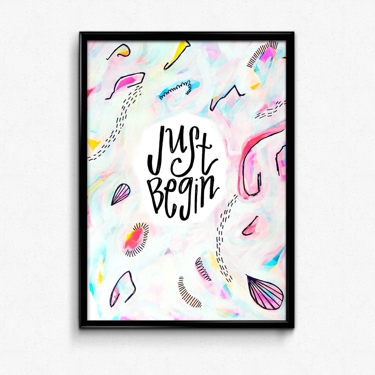
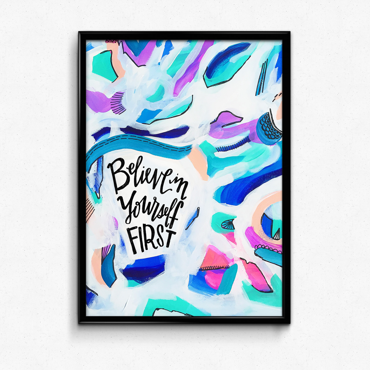
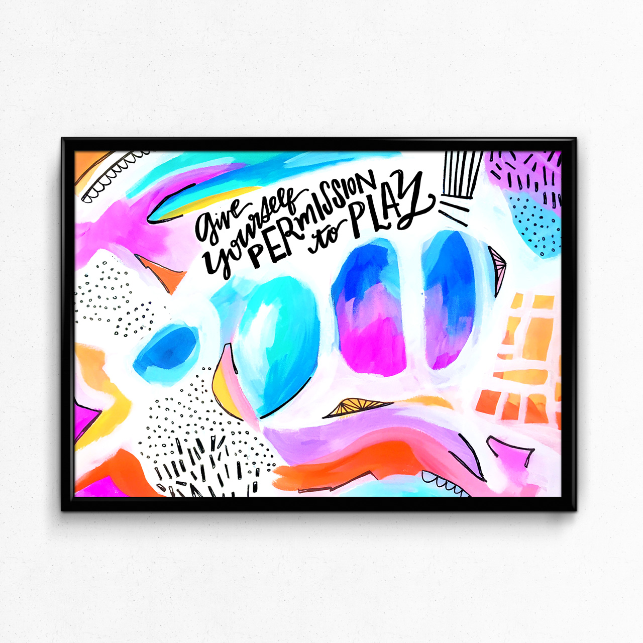
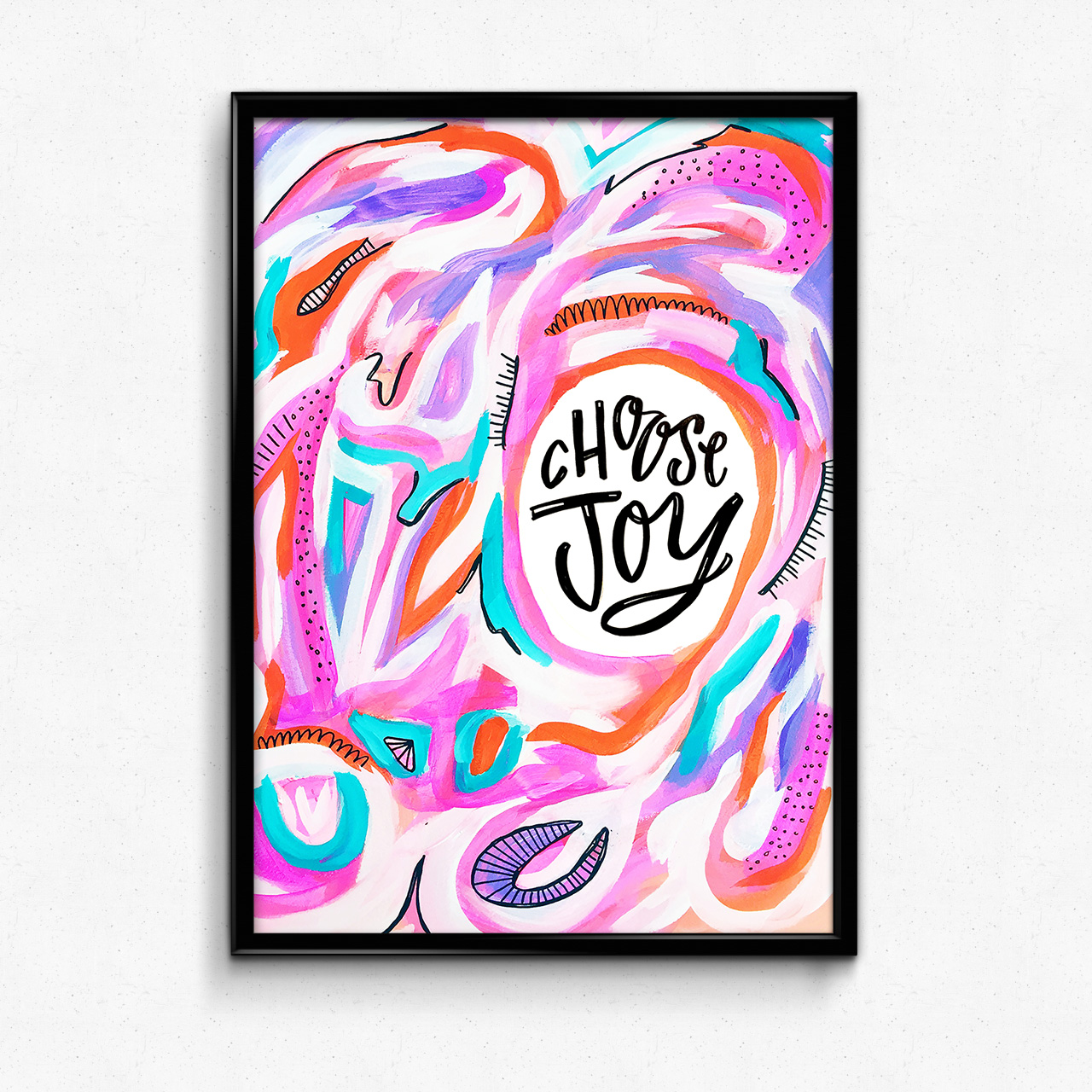
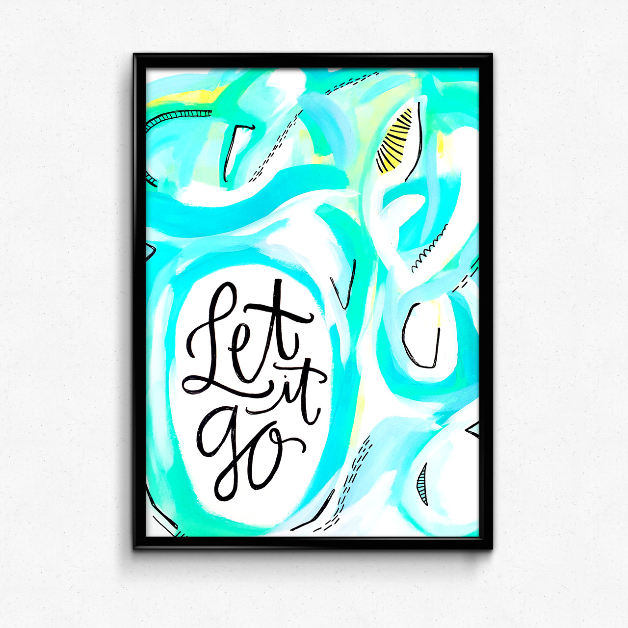
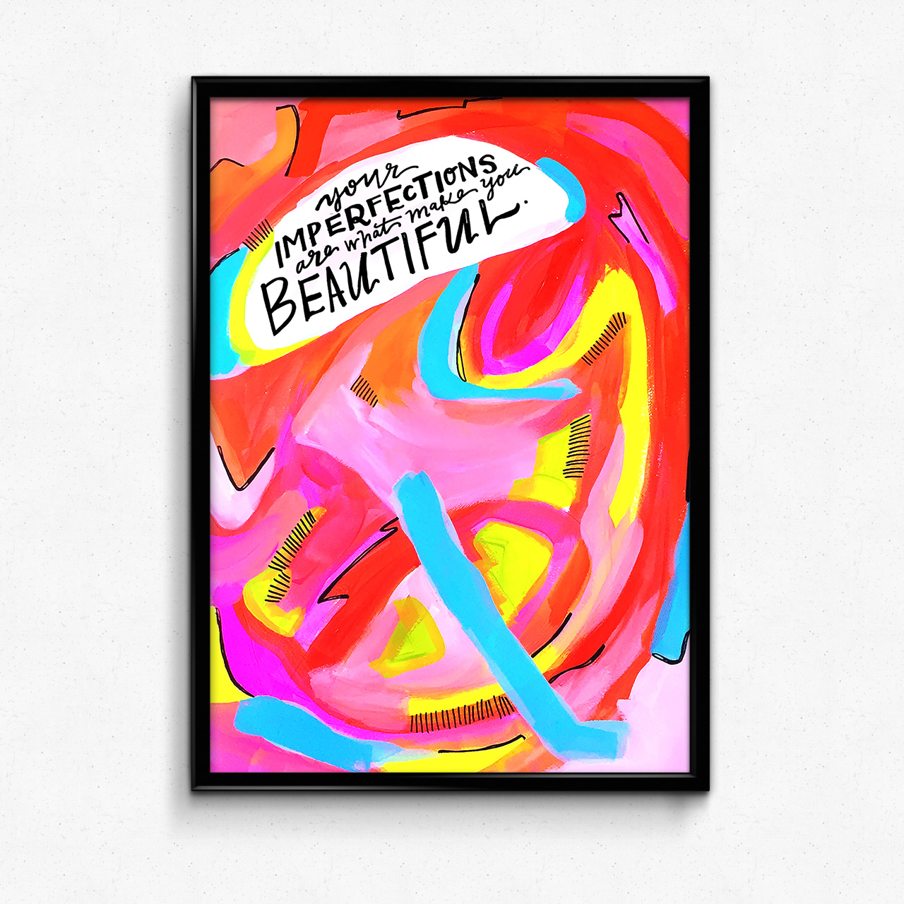
Combining my love of abstract acrylic art and hand-lettering, my plan is to share one piece every day in 2016 that expresses a different "affirmation" -- my catch-all term for the lessons, insights and positive messages that help remind me to live as my brightest self. Here's a small preview of what you can expect:
After diving head first into acrylics and art journaling for months now, I finally feel I've hit upon a style that feels my own and reflects the values and unique voice of Made Vibrant.
Using movement, color, contrast and pattern to convey a message, I want my work to represent a whole-hearted rejection of restraint. In other words, I want it to make you feel FREE.
I want each piece to remind you that imperfection is beautiful, that convention is over-rated, and that personal authenticity is your beacon for true happiness.
I never start a piece with a finished product in mind, and that's intentional. I want you to feel the spontaneity of each color palette, each brushstroke.
On top of that, I've never been more convinced of the power words have to shift our thinking and change our lives. When we speak things out loud, especially on a regular basis, they penetrate our psyche and they have an impact on the way we act and think. That's why including the lettering within each piece is so important to me. I want them to serve as positive messages to reinforce our thinking.
Now for the truly ambitious part:
I plan to make every single one of these daily pieces available for sale as limited edition, high-quality giclee prints.
I'm working right now to solidify a printing partner, and as soon as I do, I'll be launching the official Made Vibrant Art Shop. Once a week I'll release the past week's pieces as prints into the shop, with VERY limited quantities of each to keep inventory lean.
If you want to receive email updates about the shop opening and print releases, make sure you're subscribed to Self-Made Society -- Made Vibrant's email community for soulful creatives. If you're not already subscribed, just pop in your email address in this dandy field below and hit that purdy orange button!


