
It's here!!
I'm so EXCITED to finally introduce you to the new Made Vibrant site and the project that has been brewing in my head and heart for almost a YEAR now... Color Your Soul! 😱🍾💃🏽
I want to share EVERYTHING that went into this update, but first, a little backstory on what led to these big changes...
***

it began with An Evolving Business Strategy
Back in April of 2016, I started to realized that the overall Made Vibrant brand was becoming a bit muddled in my head.
I had all these online courses -- my branding course, my lettering course, an e-course about e-courses (!) -- as well as a resource shop that was rarely being visited and an Art Shop with new pieces being added to it daily.
I was starting to feel like Made Vibrant was becoming just a mix of THINGS without one cohesive concept to pull it all together.
Not only did this overall business strategy feel pretty disjointed to me, but the website started to reflect this dispersion too, like it had been cobbled together over the course of the months and years to retrofit one-off projects. (Ummmm... probably because it had.)
In an effort to embrace my 2016 word for the year, CURATE, I began to ask myself:
What do I really want Made Vibrant to offer and how can I pull that together under one logical "roof"?
I began evaluating my various offerings/revenue streams to look for a sweet spot: the place where what I'm good at meets what other people need/will pay for meets what I actually like doing.

The sweet spot became obvious pretty quickly: fun and affordable online classes.
I'm an eternal learner who is always challenging myself to cultivate new skills across a variety of topics, and I LOVE passing on that info to others in an engaging way. I view online classes like a creative medium in itself because I get to combine production design, editing, branding, curriculum design, writing... all my favorite stuff!
The Better Lettering Course -- a $20 online class -- has brought in over $70,000 alone in the two years it's been available, so I knew that low-priced (but quality) class options were resonating with my audience, making it a viable strategy from a profitability standpoint.
My plan then became to shift my focus to creating these types of affordable, bite-sized classes (between $20 - $40) more frequently and formally to build up a diverse and engaging course catalog.
That's when the thought hit me.
As my class catalog grows, it only makes sense to offer a monthly subscription to access ALL the classes at once, rather than asking people to purchase them one off. As a consumer myself, I personally love the subscription model because I'm definitely a "taster" -- I have really diverse interests and like having access to many things at one time. I felt like the Made Vibrant audience would feel the same way.
Armed with this new subscription-based focus on classes, it suddenly became clear that my old website design didn't support this business objective whatsoever.
The structure of the old site was created at a time when I only had one class, and, as I preach inside the Better Branding Course, you want your website design to support and contribute to your overall business goals. That's the whole point of having an online presence after all -- to aid in the growth of your business.
Takeaway: If you've experimented with several different revenue streams and it's starting to feel disjointed, take the time to evaluate each one and pare things down to what's most profitable AND enjoyable to you.
With a new business strategy and website re-design plan in hand, one more piece of the puzzle started to become evident...
The New Brand
***
developing an artist's brand
As I got to work planning out the new website in April, another thing started to become pretty obvious to me: I no longer felt fully connected to my own brand.
The last Made Vibrant brand update was back in April of 2015, and while the colors and overall bold, vibrant aesthetic still felt relevant, there was something... missing.
I always say that if you no longer feel your brand authentically represents who you are FULLY, then it’s time to consider an update.
(Notice this doesn't say update your brand just because you're bored with it. 😉)
In my case, a lot had evolved for me personally since that last brand refresh. Most notably, I started painting and was beginning to fully embody this identity of “artist” that I’d fought so hard to confidently claim. I wanted that story to be told through the brand.
That meant there were two big elements that felt lacking (or far too quiet) in the old brand identity that I wanted to amp up in the new one: 1) An emphasis on art and 2) Some kind of soulful element.
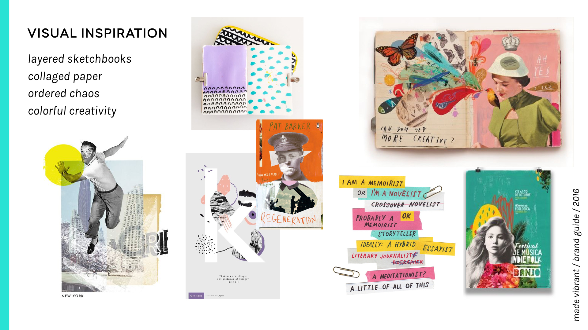
THE INSPIRATION

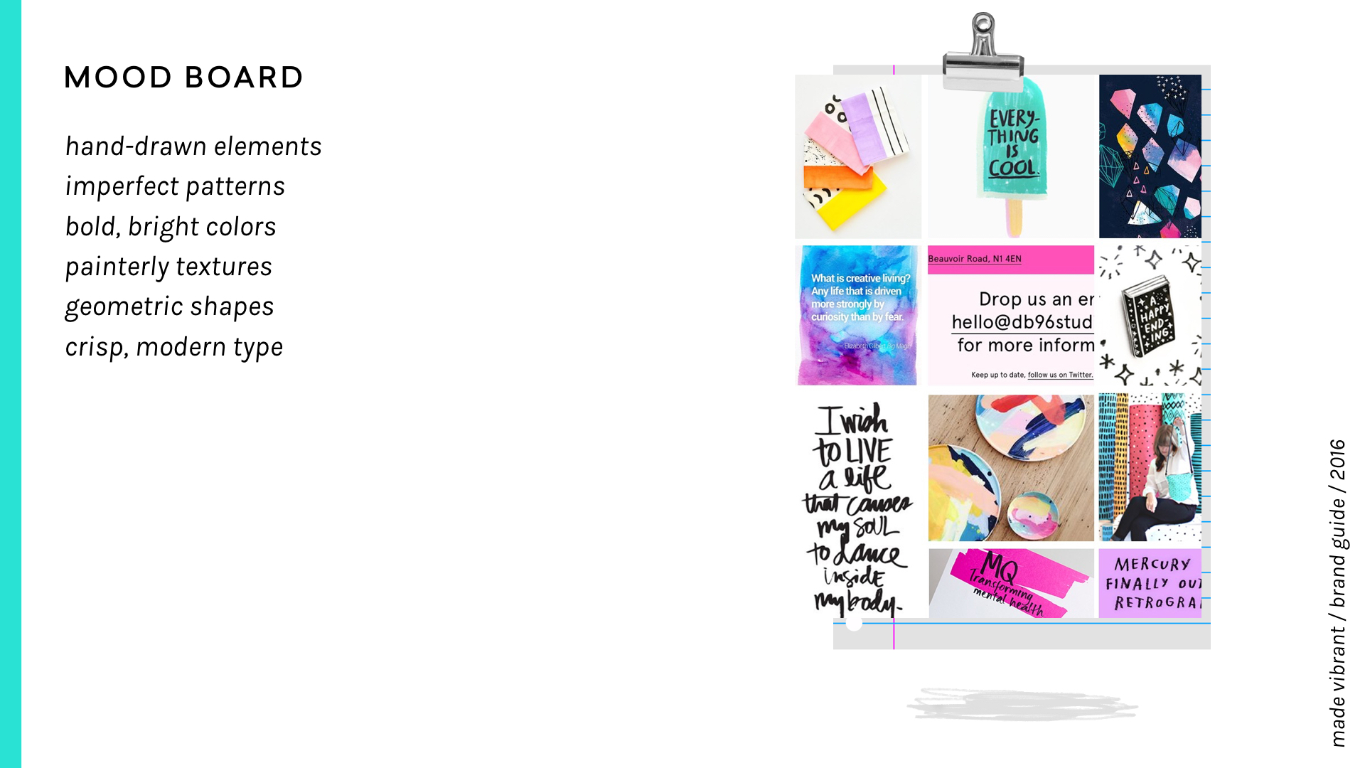
You can see the mood board that I put together to reflect the brand shift.
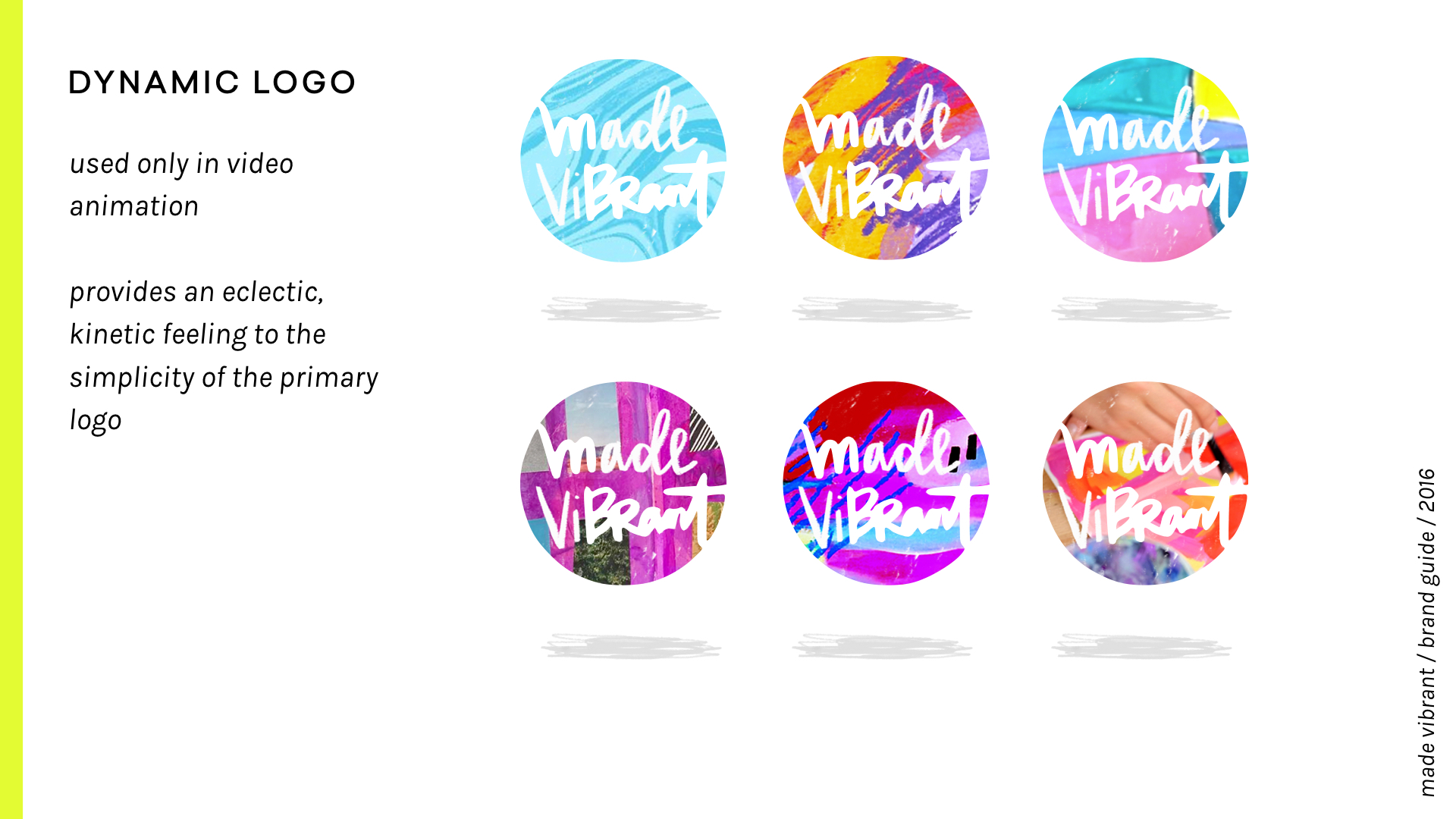
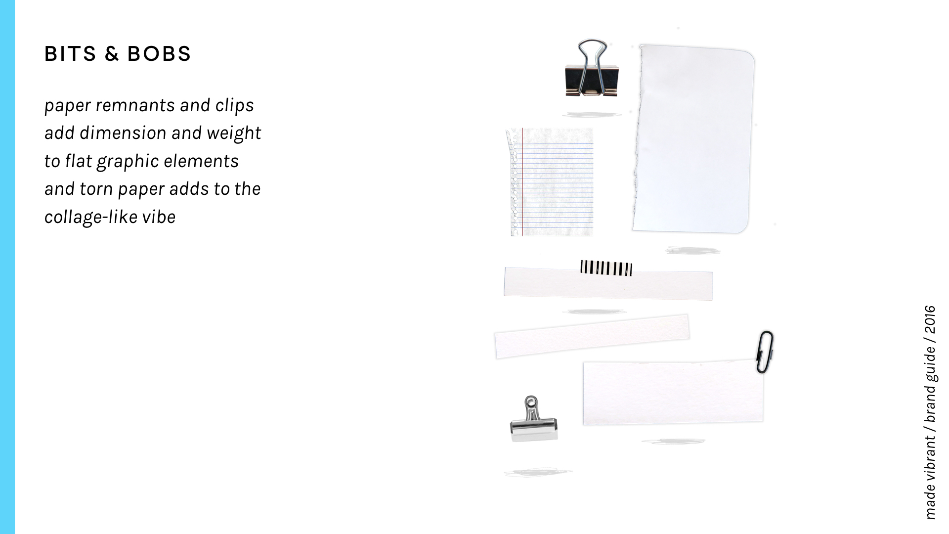
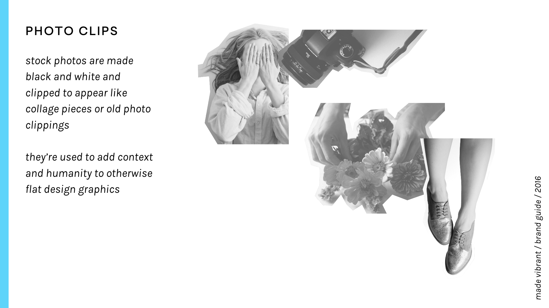
Inspired by the messy nature of acrylic paints and paper collage, I wanted to make sure that the brand carried a tactile, layered, kinetic feeling -- a feeling that I experience every day in my studio.
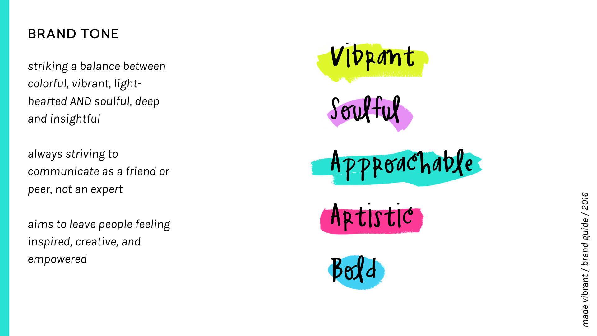
My biggest challenge with incorporating these new elements into the overall tone was in balancing the punchy, bright colors that feel joyful and fun with visual elements that carry a current of soulfulness and depth.
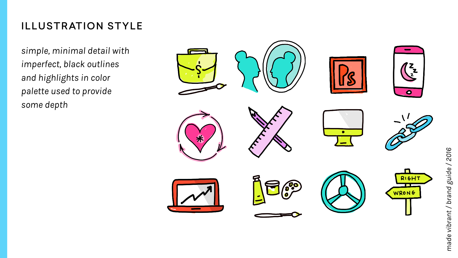
GRAPHIC ELEMENTS
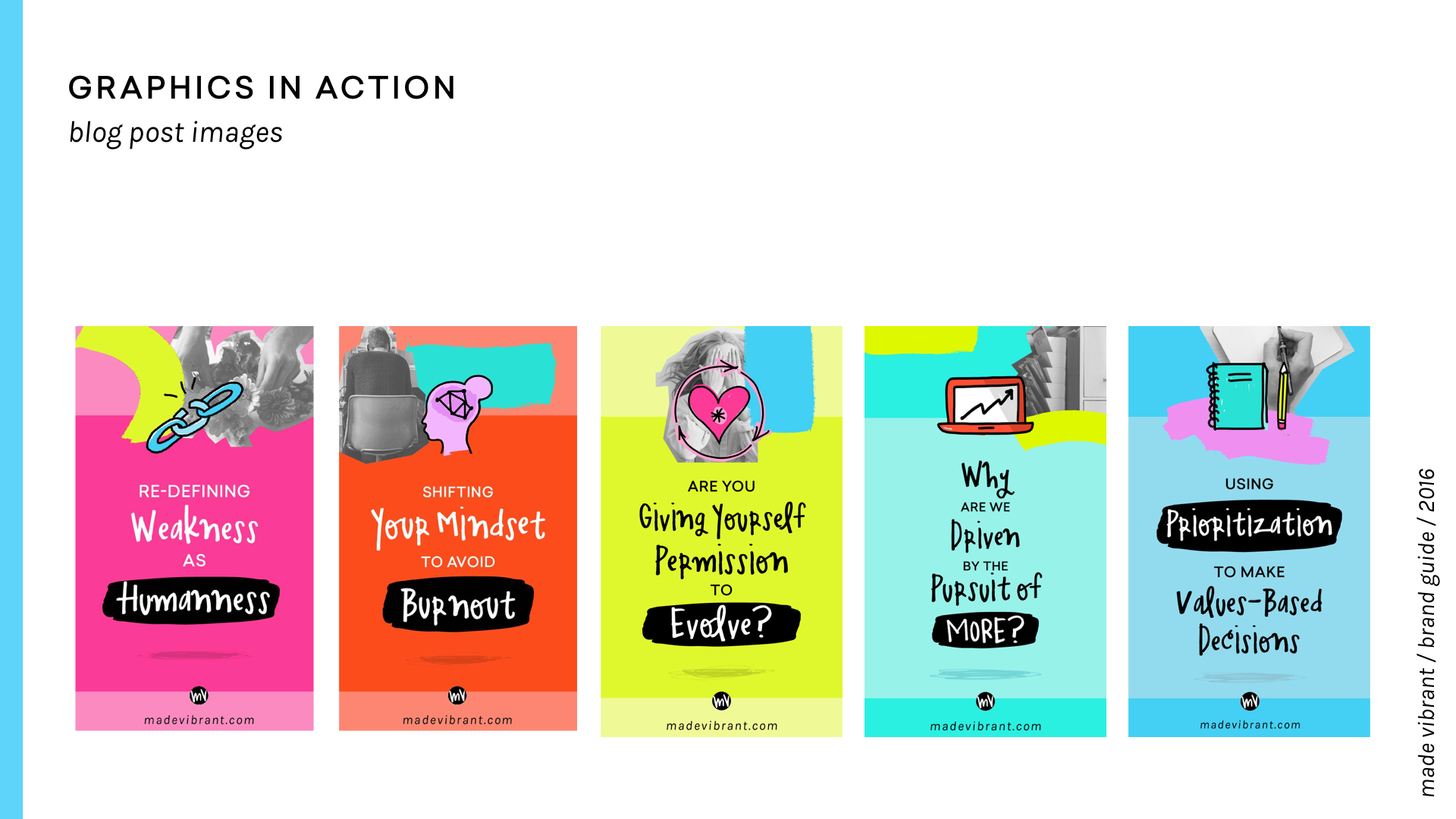
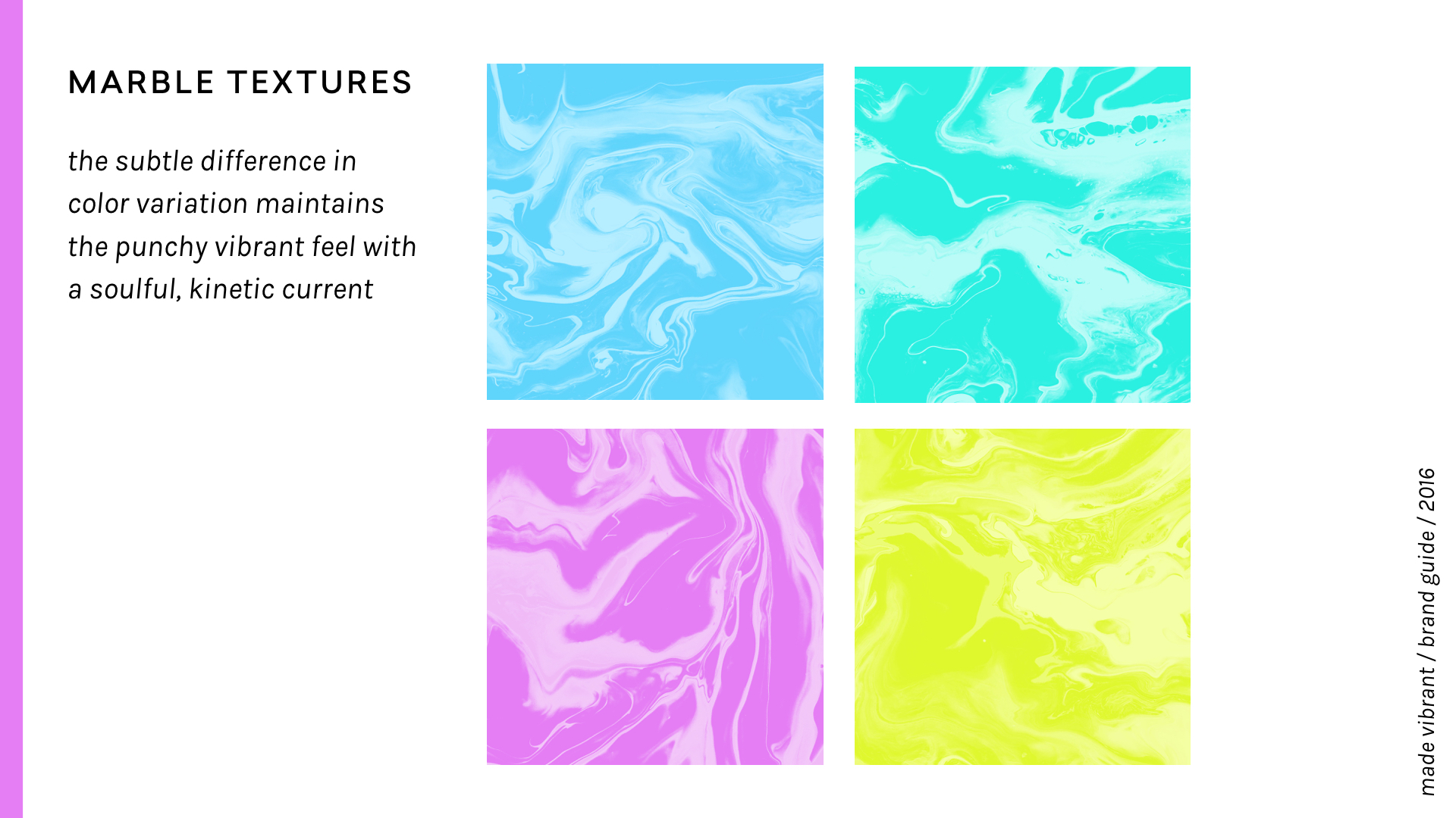
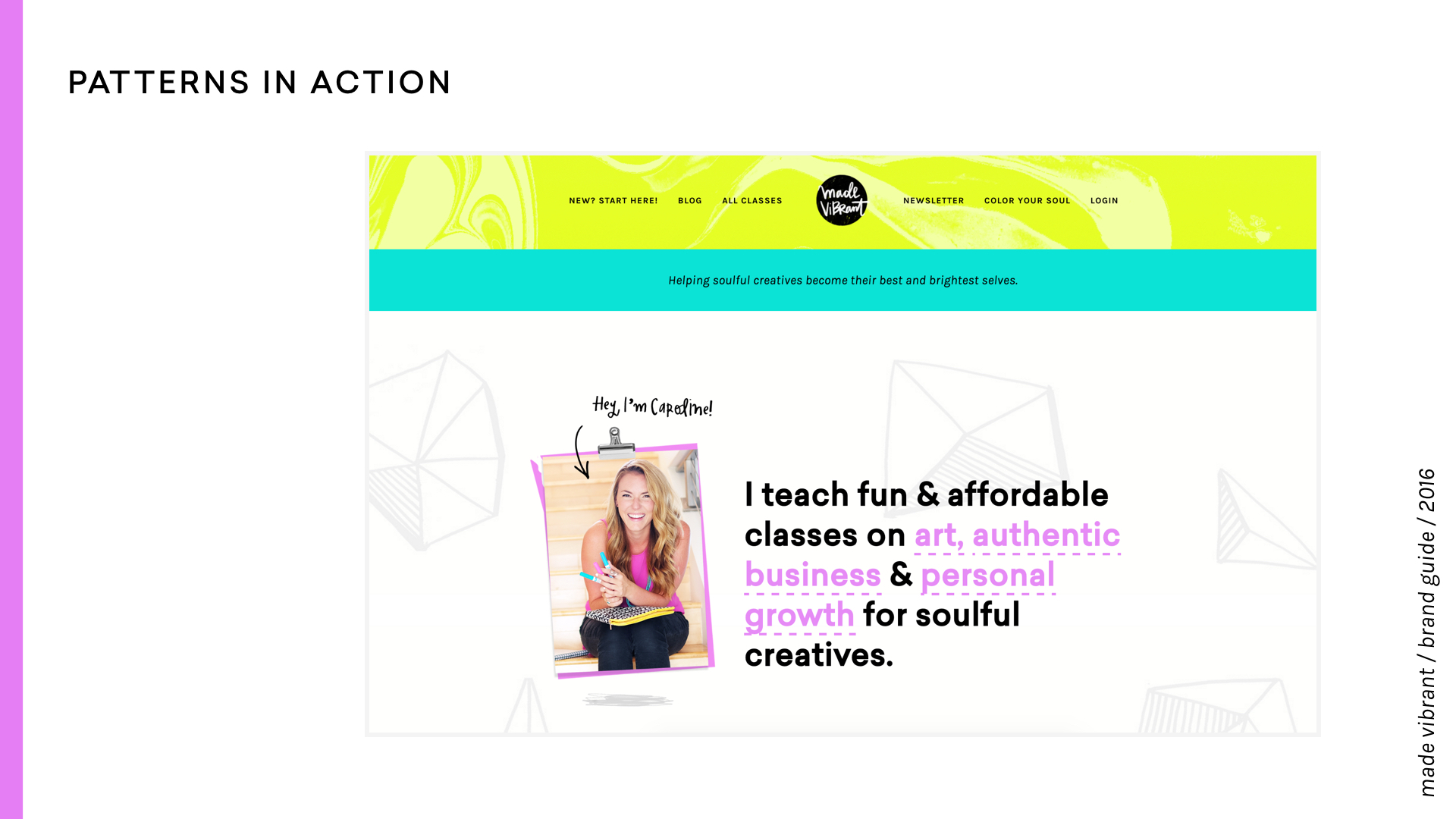
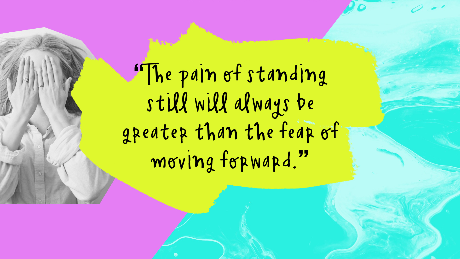
I tried out a lot of different design directions until I stumbled upon a visual solution: colorful marbled paper patterns. This became the primary inspiration for the new brand. You can see them in action on these Instagram quote cards here:
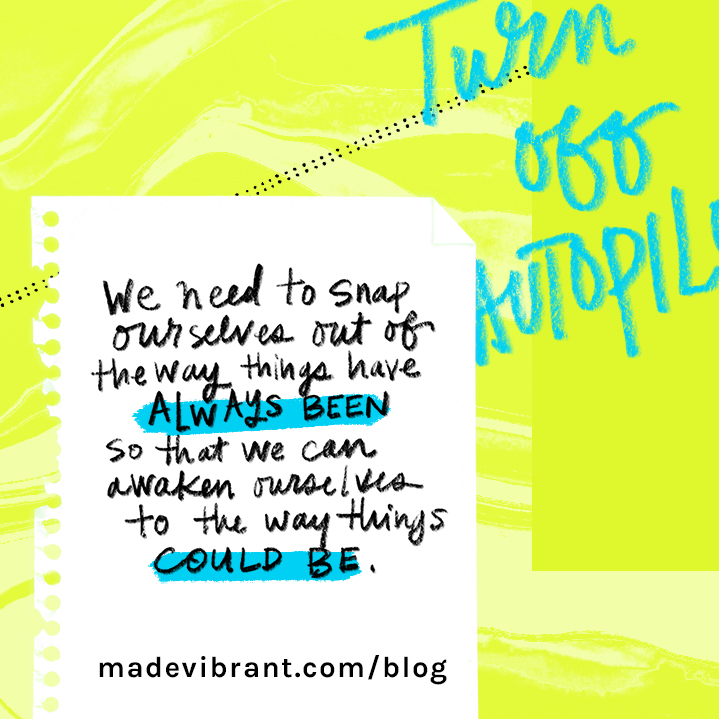
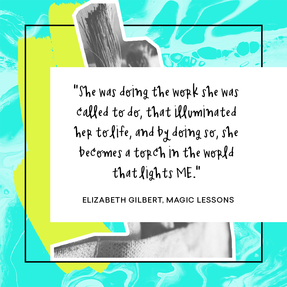
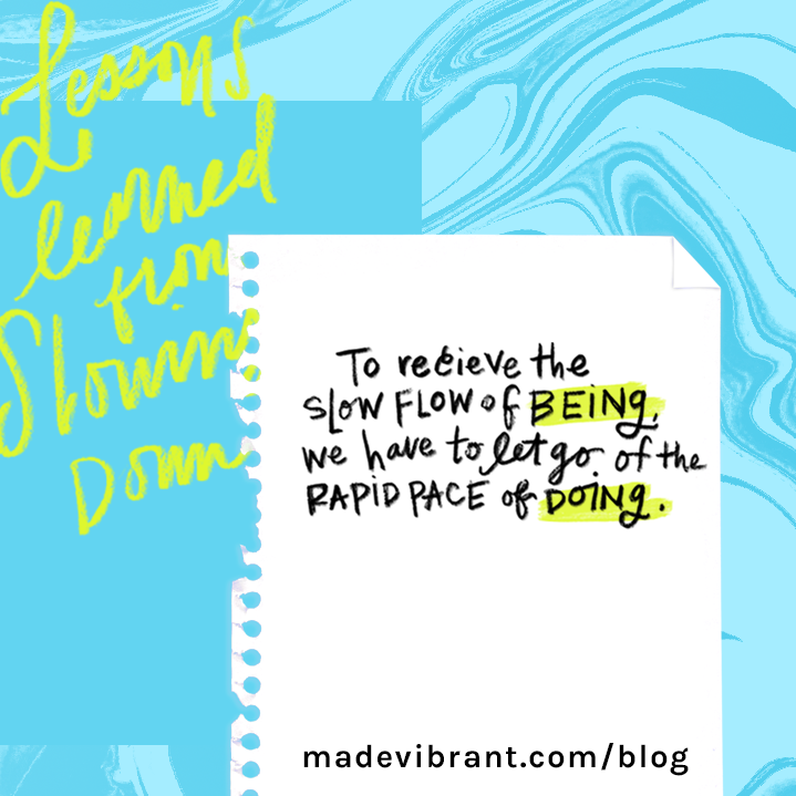
The reason I love these is that not only do they feel artistic and kinetic like I talked about above, but there’s a soulful, almost celestial quality to them that reminds me of the galaxy and the ocean at the same time.
Once I created those as an inspiration jumping off point, the rest of the brand just started to flow right out of me.
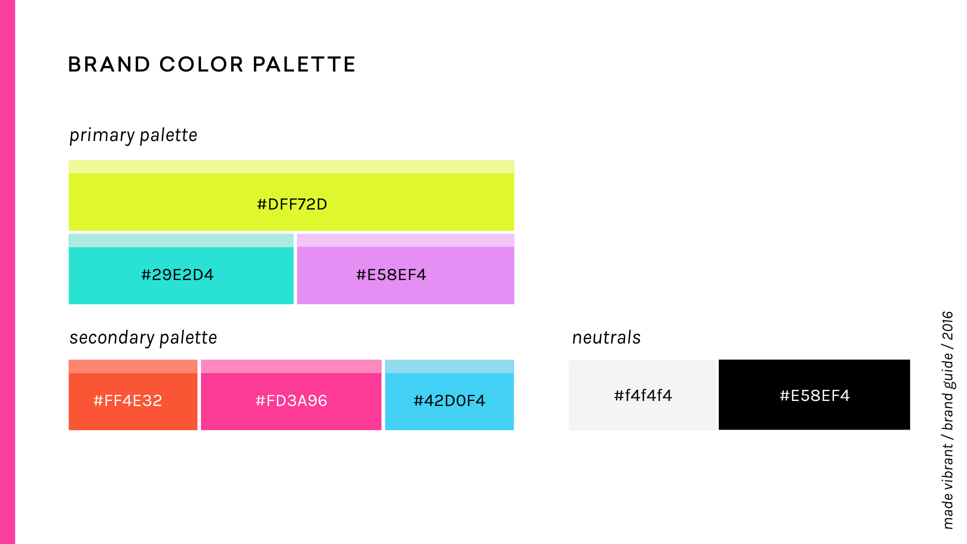
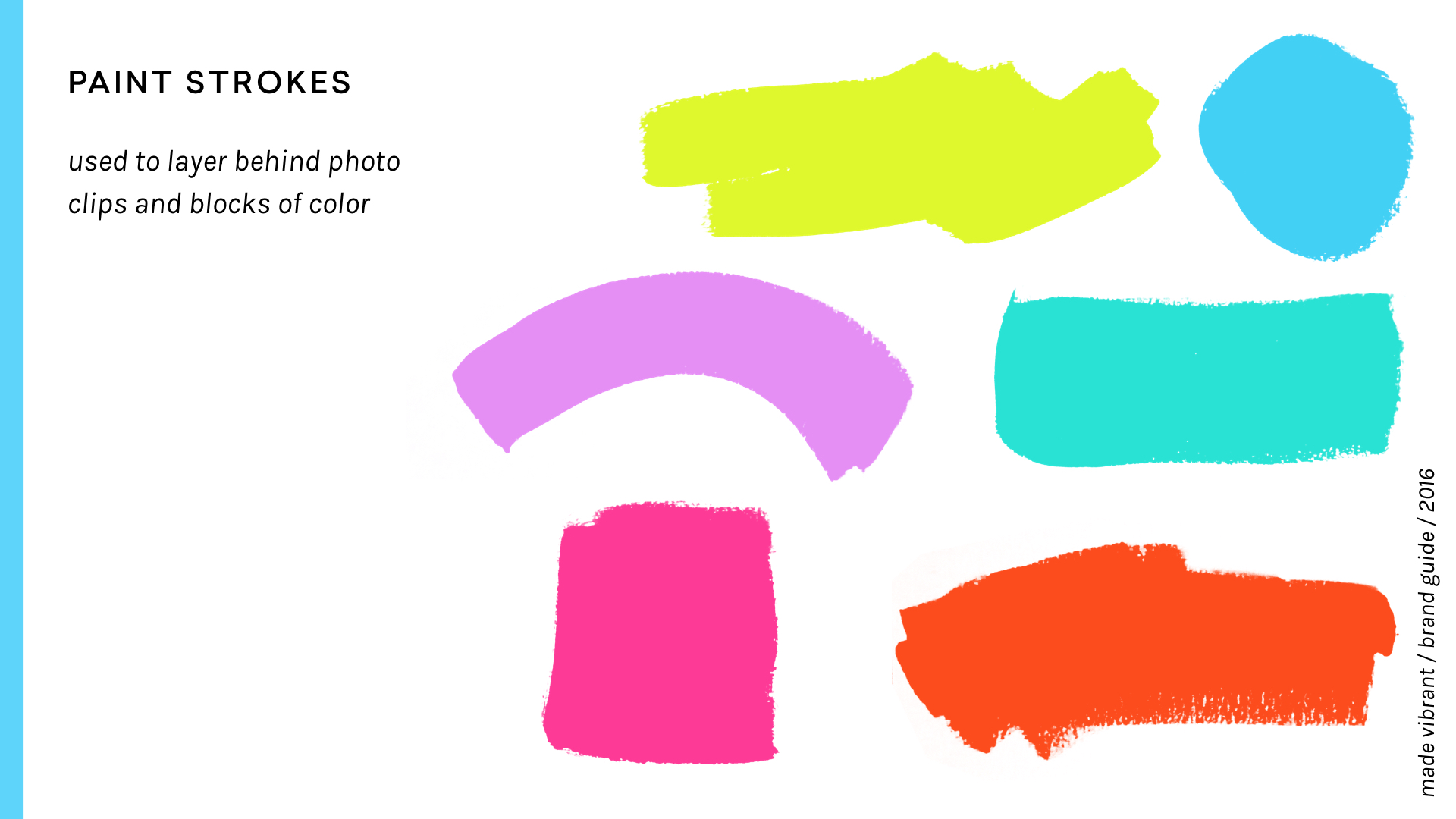
I kept the old color palette primarily the same with the addition of a few lighter accent tints to provide more flexibility with the palette.
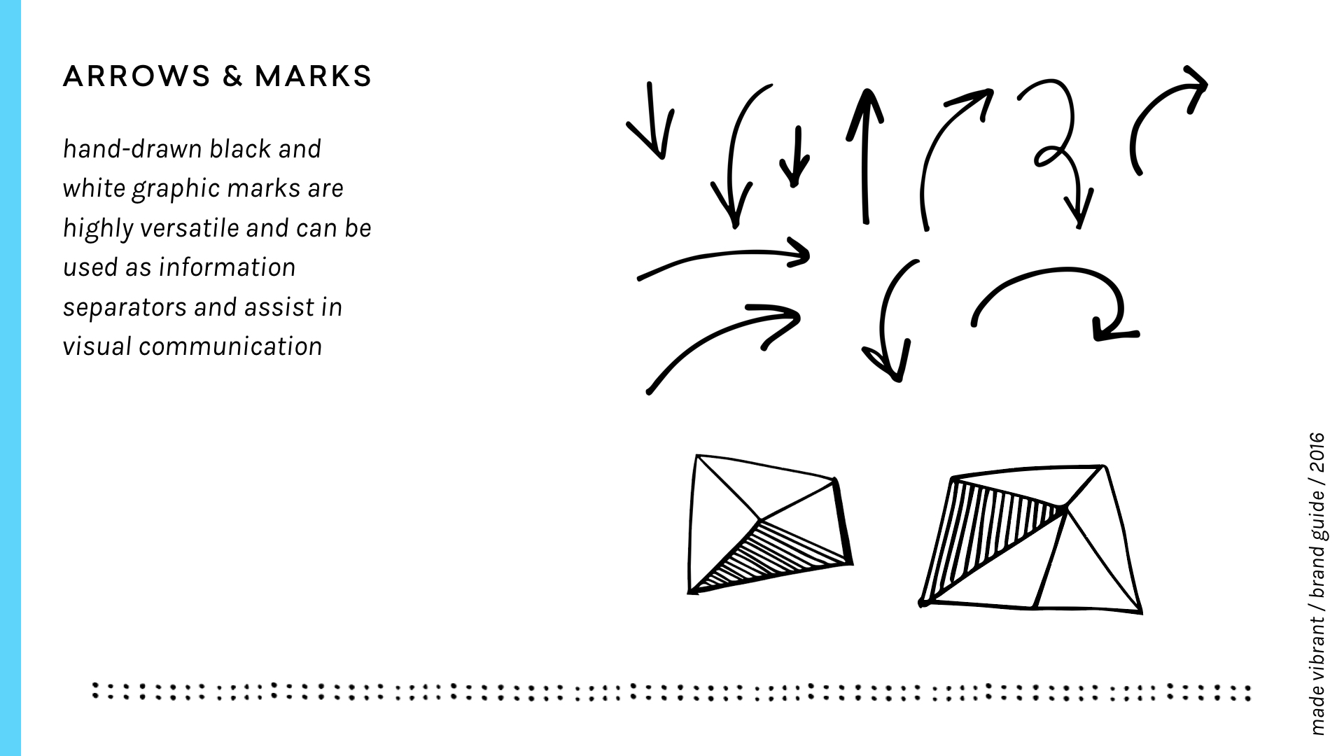
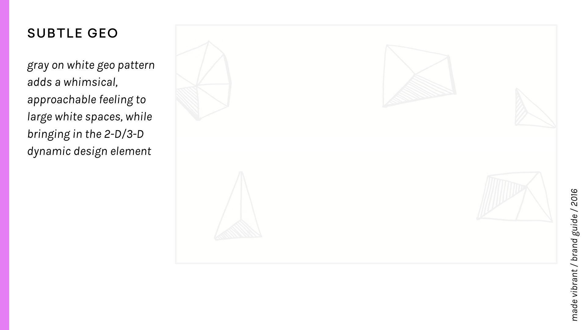
The biggest change came in the expansion of graphic elements and collage-like photo treatments which give the overall brand a layered, artistic, collage-like vibe. I also wanted to play with the intermingling of a flat 2-dimensional style and a more 3-dimensional multi-media art vibe, so I included these little hand-drawn scribble shadows (inspired by the illustration work of Oliver Jeffers) throughout the branding to offer up some depth and visual interest.
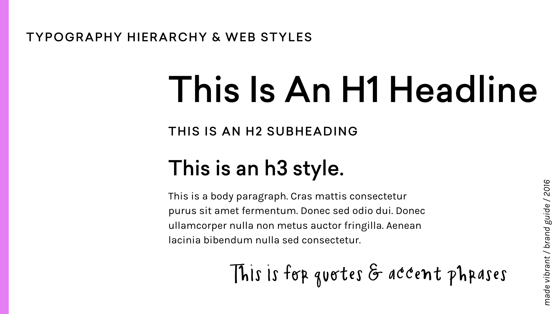
TYPOGRAPHY
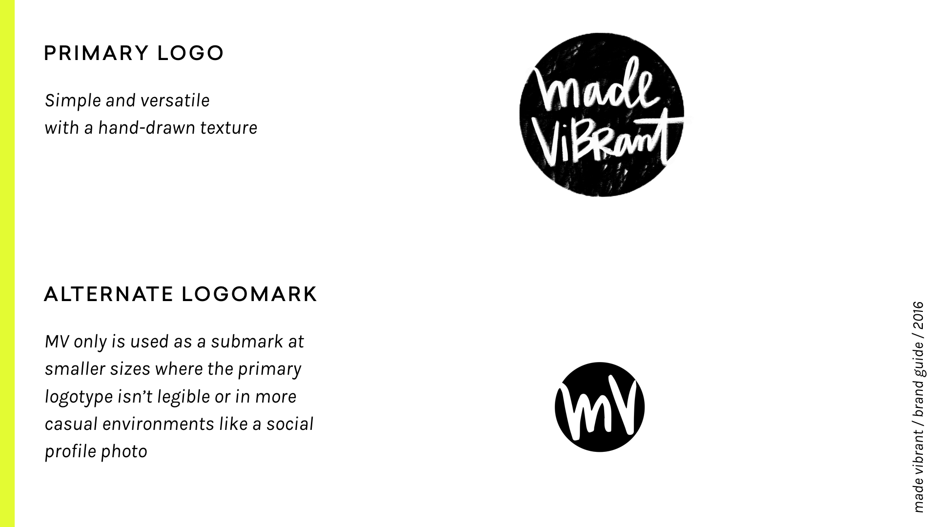
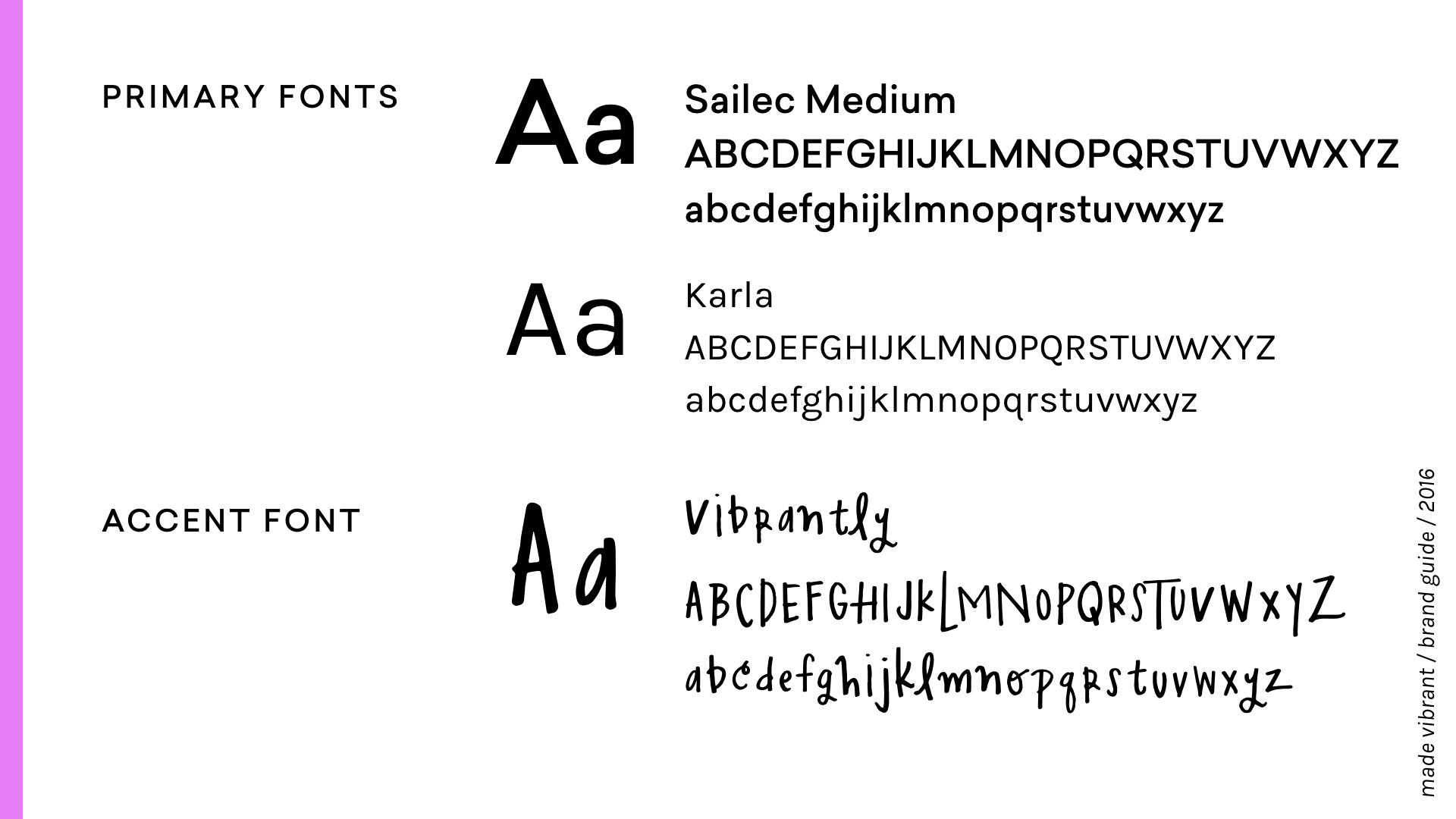
I updated my typography palette to include two new fonts, Karla and Sailec. Each one fits a role similar to my previous brand font (Adelle Sans), but I really love how modern and bold the geometric sans of Sailec feels with the friendlier and versatile Karla.
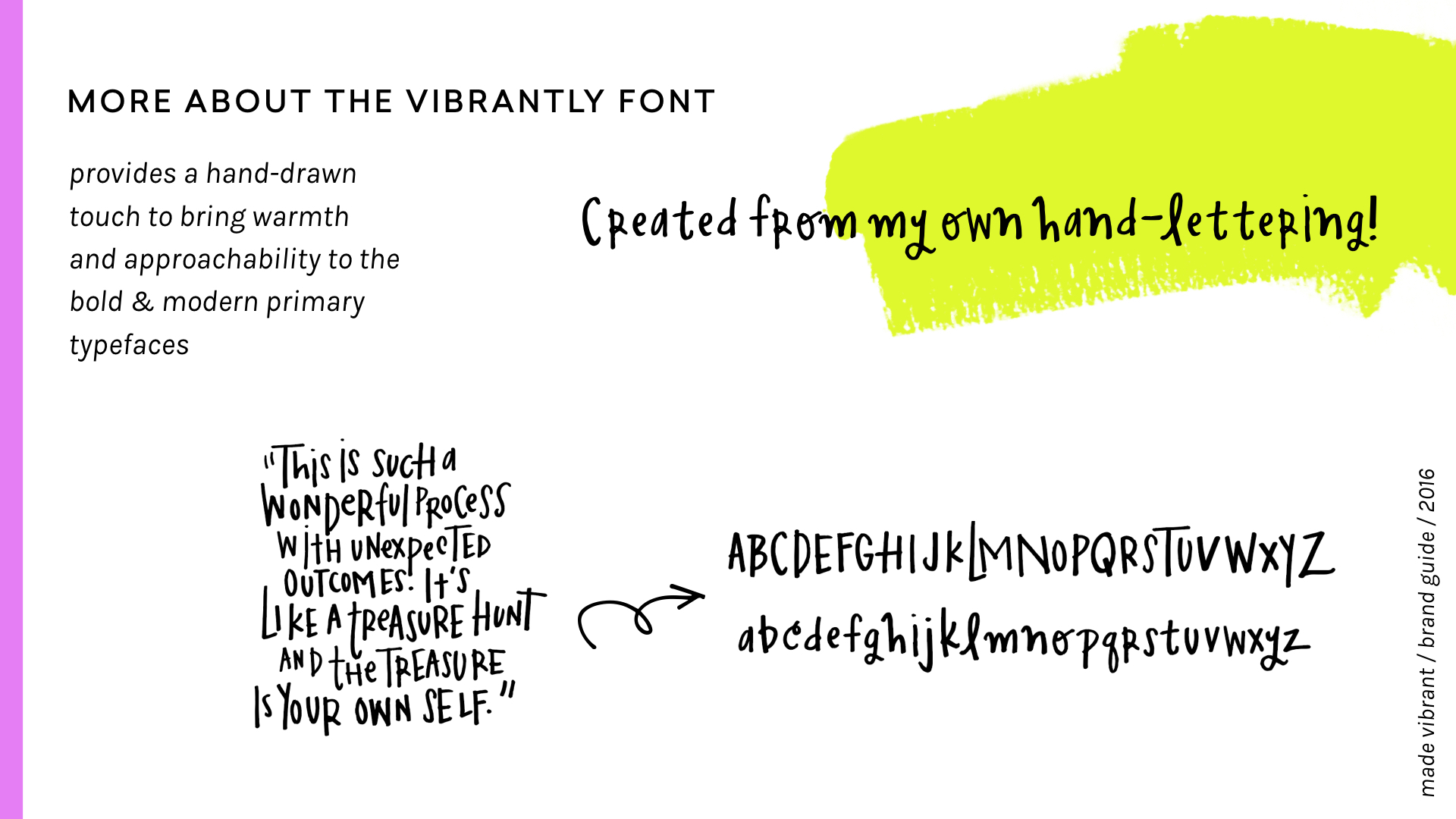
I also made a custom accent font, VIBRANTLY, from my own hand-lettering, which adds an approachable, personal vibe to the largely modern and basic typography palette:
Hi, I'm Vibrantly! A bold yet quirky handwritten font!
Nice to meet you!
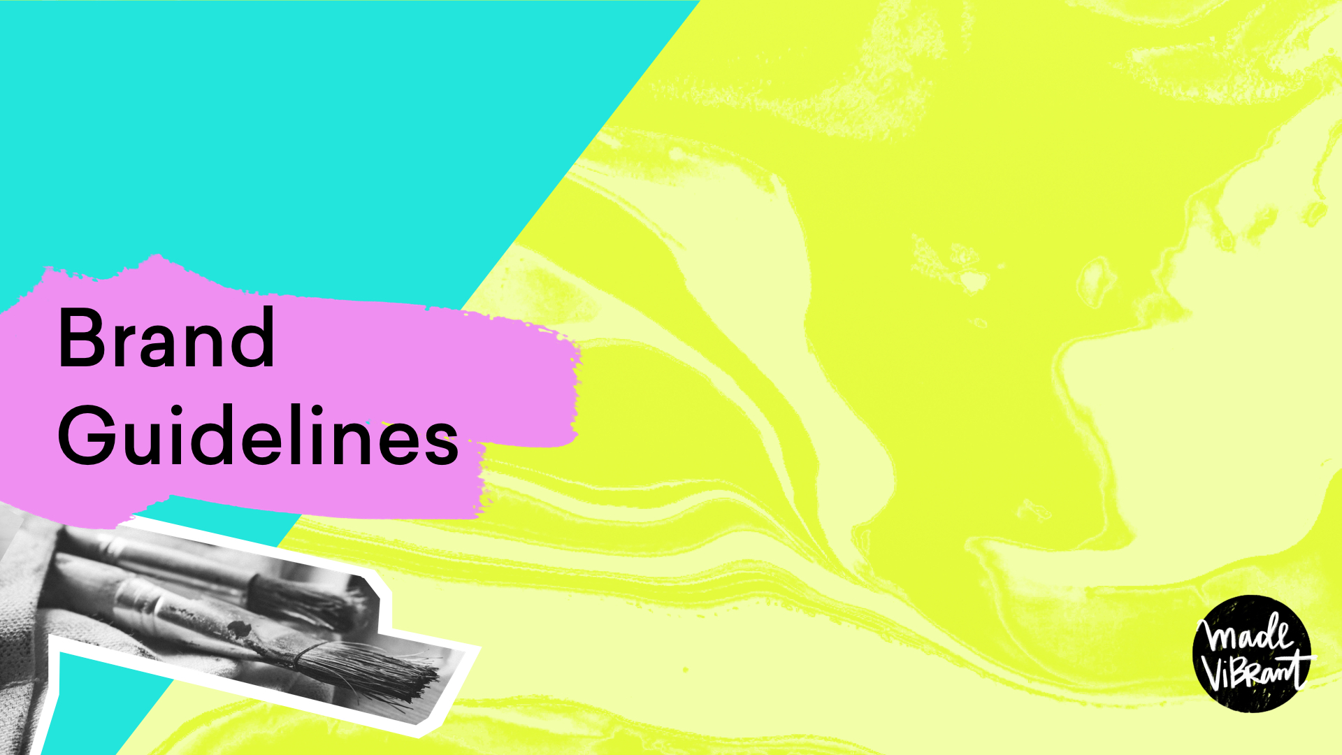
To check out all the new brand elements in action, you can flip through the new brand guidelines I created here:
Takeaway: Your brand should feel like it aligns fully with who you are (and, in some cases, who you're becoming.)
It's important that you feel emotionally connected to it so you can feel proud to get out there and share your business and your heart's work.
The New Website
***
rethinking everything
Once the new brand was in place, the website redesign process started to really accelerate because I could finally see a clear vision for the brand vibe emerging.
(To give you an idea of the website evolution process, here's how the Made Vibrant site has changed over the years:)


You can see the slight update in the color palette and layout, but overall the sites feel very similar in style.
In website updates in the past, I mainly focused on updating the aesthetics, not necessarily rethinking every single page from the ground up.
This time around though, I really wanted to throw all the other site iterations out the window and start from zero, keeping my new business strategy in mind. On every single page I asked myself:
What one action do I want someone to take on this page?
I really tried to practice what I preach inside the Better Branding Course, which is to not only meet the needs of a visitor by delivering what they might be looking for, but also balance that with the objective I have for the site: to get people to sign up for the individual online classes or the monthly subscription, Color Your Soul (more on that below!)
That meant a more streamlined navigation and home page, with the emphasis being the classes and Color Your Soul.

other THINGS THAT ARE NEW:
Blog Feed page - I made it easier to see multiple posts at a glance PLUS I created category pages (like this one) to make sure visitors can easily find the type of content they’re looking for
Full-width blog posts - What?! No sidebar? Ahhhh! I probably made this into a bigger issue than it needed to be, but I was really torn on this decision. I love reading content that doesn't have a distracting sidebar, and my writing always felt a bit constrained in the old post design BUT sidebars are highly functional. They can introduce you to a new visitor and I didn't want to miss out on that. My solution? A little hello image that is added to each post so that new visitors will have a small idea of who I am as they read. It may not be a fancy solution, but I kind of like that in this layout, images play off the text like little clippings of visual interest.
Classes page - Believe it or not, on the old site I didn’t have one easily accessible page where visitors could see at a glance ALL my class offerings. This page will be even more important in the future as new classes are added every month!
Login page - Laura and I get emails on a regular basis from students that can’t locate where to login to their classes (or don't want to search for their Welcome email) so having one place to log in to individual classes or to access the exclusive Color Your Soul content dashboard was a must.
And of course, the Color Your Soul page is new! Color Your Soul is what my idea for creating an online class subscription turned into (more on this below!) This page explains exactly what it is and what's included in the subscription. I especially had fun planning and editing the Color Your Soul trailer video to explain the subscription.
Technical considerations
From a technical standpoint, there were two big changes.
First, I decided to switch my Squarespace template over from Bryant to Pacific.
The main reason for this was to take advantage of their Index Page feature, which allows me to create full-width color-banded sections within one page. From a design standpoint, I love that I can clearly separate/define areas and organize information, and it's a great opportunity to use those fun marble brand patterns!
The other big move was to find a way to manage subscriptions and create paywalled, exclusive content for the Color Your Soul Subscribers.
I've seen others use the service Tinypass before, and I tried months ago to play around with their product but it seemed overly complicated to me. Thankfully, Jason encouraged me to do another search back in May thinking that maybe someone had improved the experience since I first did my research, and he was right!
Enter... Memberspace.
Memberspace is literally a service for managing memberships through Squarespace. 🙌 It was a match made in heaven!
They make it SUPER simple to set up plans, manage member accounts and create paywalled content, which is where all the Color Your Soul content lives (only accessible to paying members.)
**ps. If you're interested in using Memberspace on your own site, you can get 10% off your first three months with them by using the code "color_your_soul" at checkout!**
Speaking of Color Your Soul, you may be wondering at what point my "online class subscription" idea turned into something called Color Your Soul...
Color Your Soul
***
a year in the making
It all started with a desire to create online content that felt deeper.
Around November of last year I had this idea to create a monthly magazine of sorts that would center around one central theme each month. I wanted to release it in January of 2016 (some of you might even remember a live workshop I did announcing the idea to gauge interest.)
The problem is that I felt rushed to create something in one month that didn't even feel fully formed in my own head yet. So I scrapped it.
The idea sat in the back of my head, waiting for the right moment to pop back up, but I never fully let it go.
When I came to my conclusion about wanting to create a monthly subscription that could house all my online classes, Color Your Soul popped right back into my head and it became clear that THIS was the missing thread I was looking for to tie the various pieces of Made Vibrant together.
***
A DESIRE TO CREATE SOMETHING DEEPER
It was around this time that I was also starting to feel like even though I LOVED teaching online classes, the whole info-preneurship movement was reaching peak saturation.
I felt like there were all these THINGS being thrown around telling people HOW TO do X, Y and Z, and I didn't want to be just another person adding to the noise.
I wanted my classes and content to come from a place of inspiration and depth, not just wanting to make another quick buck by telling someone HOW TO do something.
As I thought about what kind of monthly subscription I myself would want to subscribe to, the idea of what Color Your Soul could become started to come into focus.
It would be part digital magazine, part learning community, part art gallery... all centering around one mindfulness theme every month.
“Part digital magazine, part learning community, part art gallery... all centering around one mindfulness theme every month. ”
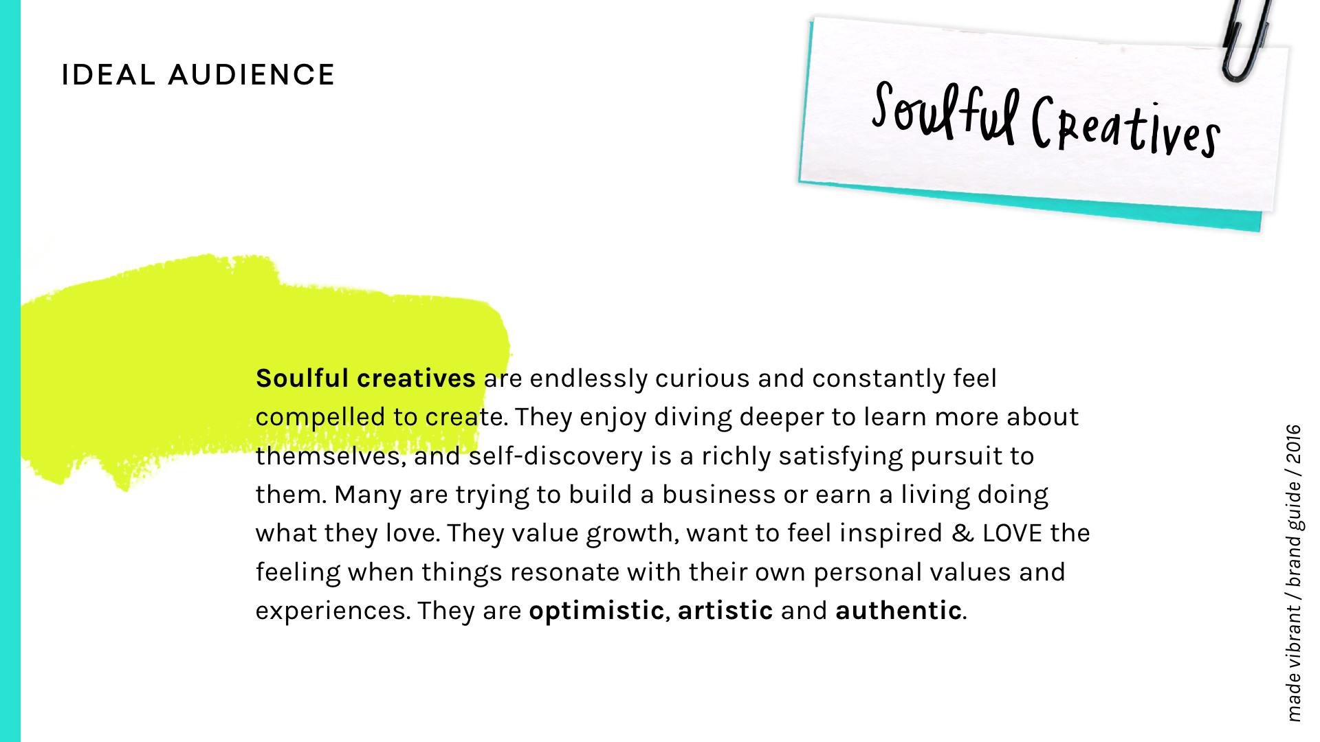
The goal would be to inspire, to teach and to encourage soulful creatives to fully embody these themes that have brought such beautiful growth into my life.
Themes like FREEDOM. And gratitude. And courage. And authenticity.
And rather than continuing to TELL you what Color Your Soul is, how about I show you:
I just wrapped up the first issue for September 2016, and already it's becoming more than I ever dreamed it would be. I finally feel like the unique mix of art/creativity, business/design and personal growth that has always been signature to Made Vibrant now has a beautiful conceptual package to live in thanks to Color Your Soul.
***
Color Your Soul in the future
I have so many ideas and visions for how Color Your Soul could evolve in the future. At the top of that list is definitely some sort of community aspect so that subscribers can meet each other, collaborate and share in an open and safe space.
I'd also love to expand the digital magazine to include contributions from other soulful creatives and hear about how the various themes have impacted them.
I hope you’ll consider coming along for that journey by signing up!

A monthly digital magazine to make your life more vibrant PLUS ongoing access to the Made Vibrant class catalog!
In A Nutshell
***
Made Vibrant is still the colorful, approachable hub for creativity and curiosity that it always has been, but now it has a focus that feels more cohesive, more purposeful and more CURATED.
My mission and the mission of this space has been and will continue to be: helping soulful creatives (like you!) become the best, brightest versions of themselves.
“Helping soulful creatives become the best, brightest versions of themselves.”
My sincere hope is that these changes will provide me with authentic foundation to evolve this business further over the next couple years.
Thanks to all of you that have continued to come along for the ride!


